COVID-19 and Household Overcrowding Vulnerability
Social Vulnerability Index (SVI) Breakdown at County Level
As a measure of vulnerability during the Coronavirus pandemic, crowding, one of the fifteen social factors composing the Social Vulnerability Index (SVI), serves as a metric to identify vulnerable US counties with high rates of occupancy per room (PPR). The CDC calculates PPR at 1.5 or more persons per room, which leads to higher vulnerability of a household. This metric is particularly important during the spread of a new highly contagious infectious disease because crowding is a condition-based indicator that helps understand vulnerability at an urban and rural scale based on the National Center for Health Statistics(NCHS)/CDC classification.
Methodology: Part 1: As the Social Vulnerability Index (SVI) is broken down, how would focusing on a single social factor (Crowding) help understand the vulnerability of a household at a county/census tract level through the following framework? County Identification:
- SVI Vulnerability Level: 0.975-1 Level
- SVI Crowding Vulnerability Level: 0.975-1 Level
- National Center for Health Statistics(NCHS)/CDC classification
- What is the classification of the most vulnerable counties?
- What region are they located?
- What are their characteristics?
- Population
- Main Industry(ies)
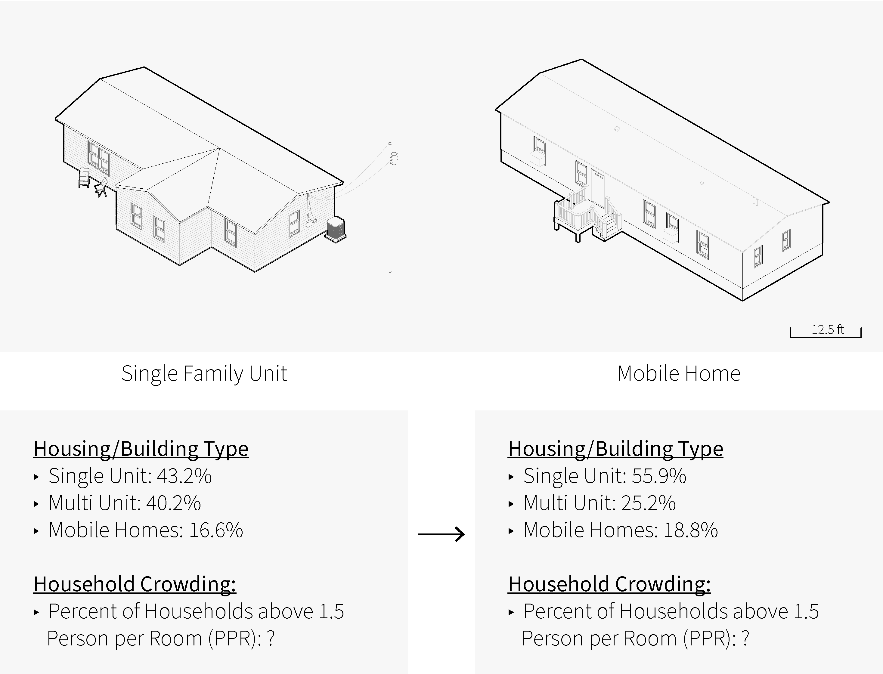
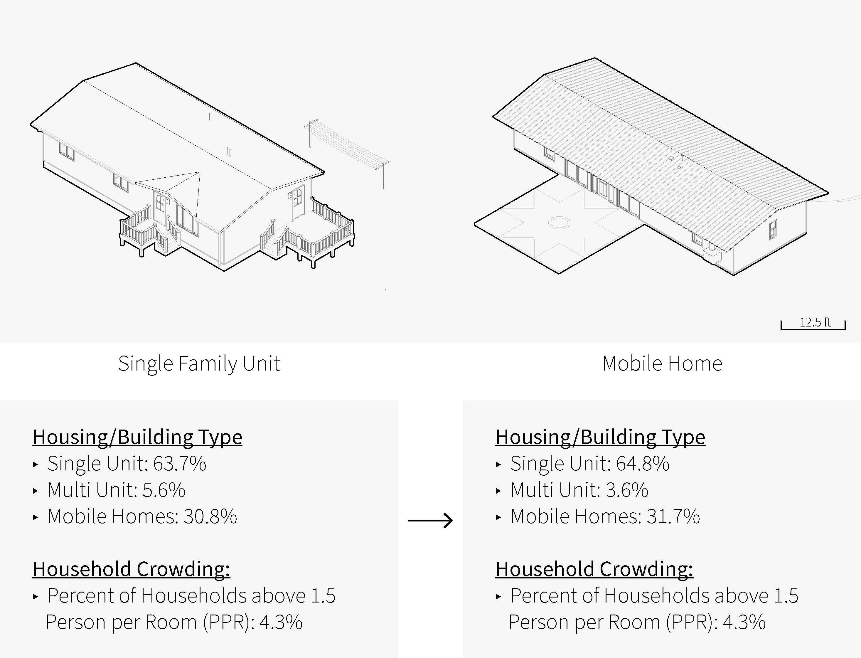
- Housing typologies (Mobile Homes/Multi-Unit Structures)
- Total household count
- Percentage of household considered crowded (PPR: 1.5 or higher)
- Socioeconomics
- Poverty Levels (census tract level)
–
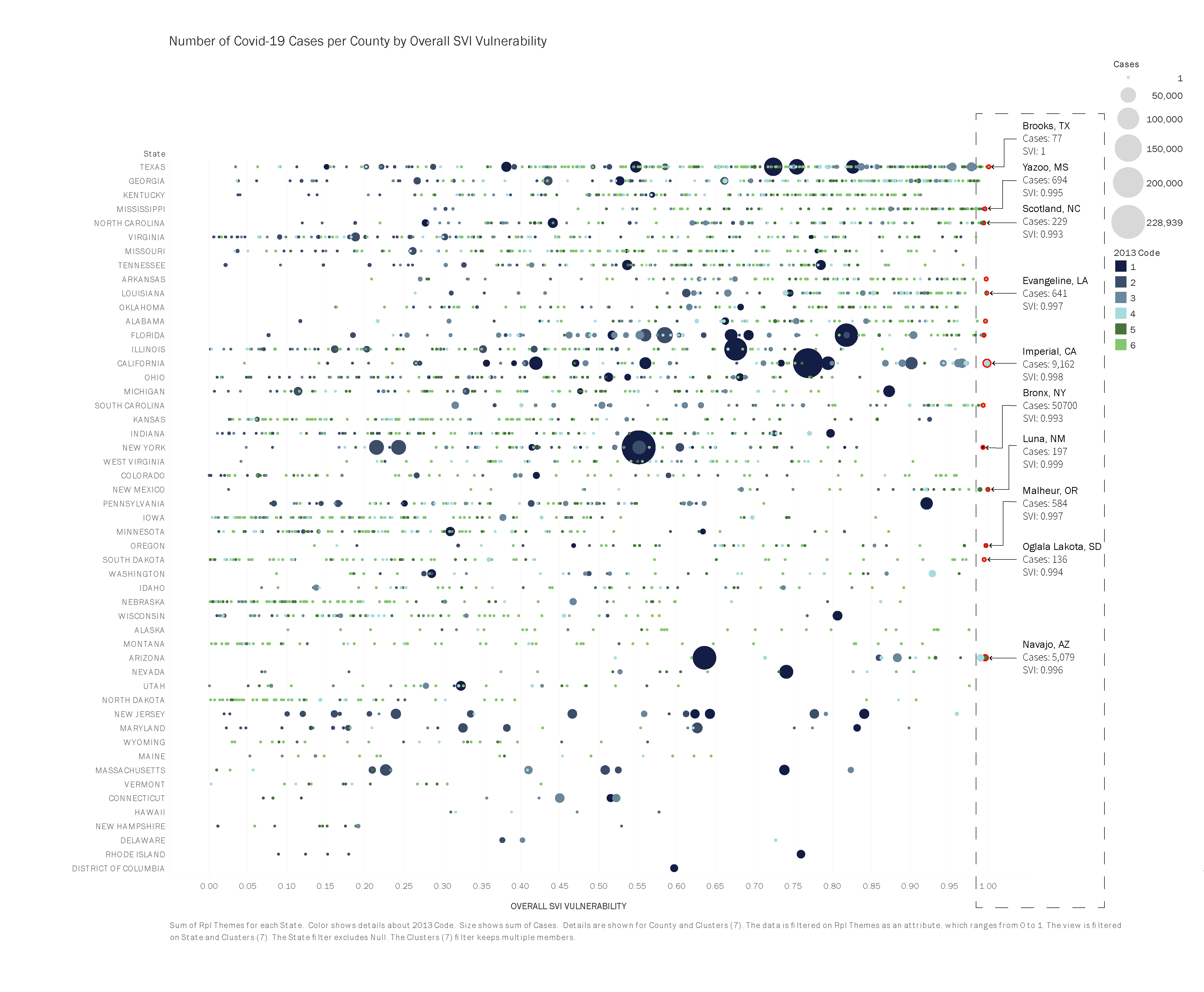
Plotting the Data: Overall SVI at County Level per State
 Source: CDC Social Vulnerability Index (SVI). Link to sources text of link.
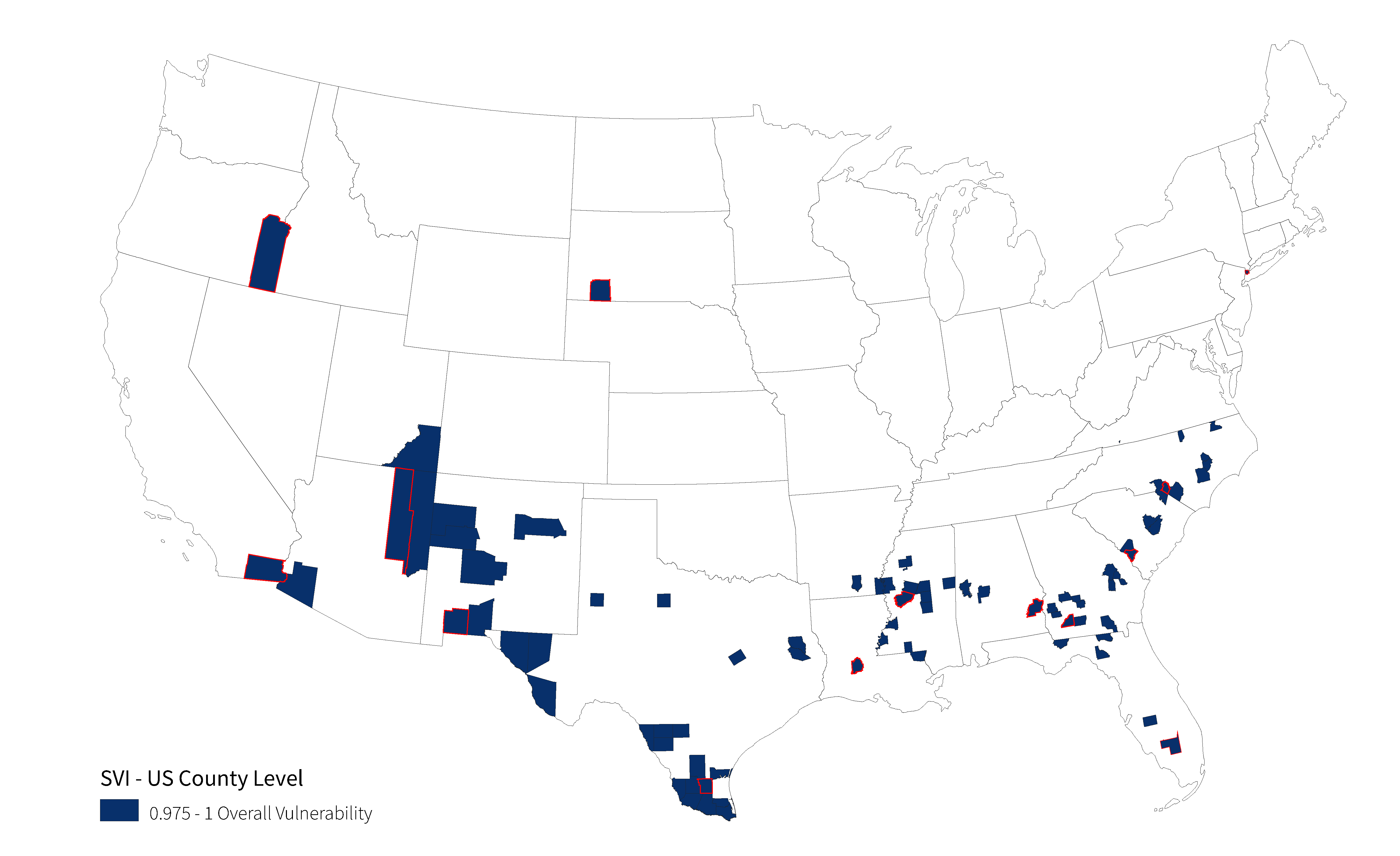
Mapping: Overall SVI at County Level per State
All of the counties and their overall vulnerability is being plotted in the graph above. The sizes of the circles represent the count of COVID-19 cases in the county. The data reflects the vulnerability scale that the CDC Social Vulnerability Index (SVI) uses to classify counties base on their individual vulnerability. It ranges from 0 tp 1.
The map geolocates the counties that are most vulnerable based on the overall SVI scale. Counties that have a vulnerability of 0.975 or higher are shown. Highlighted with the red outline are the counties with the highest vulnerability.
–
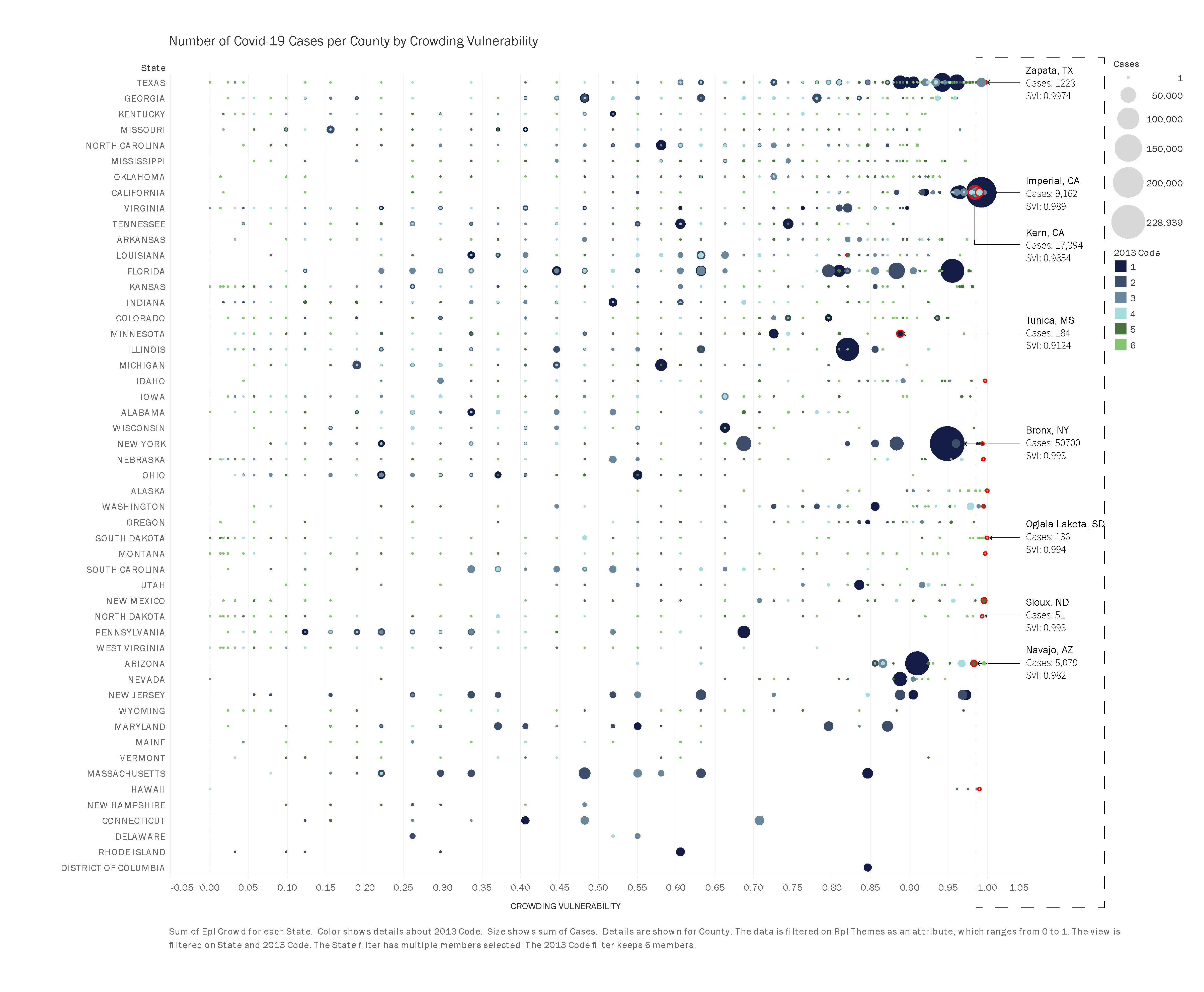
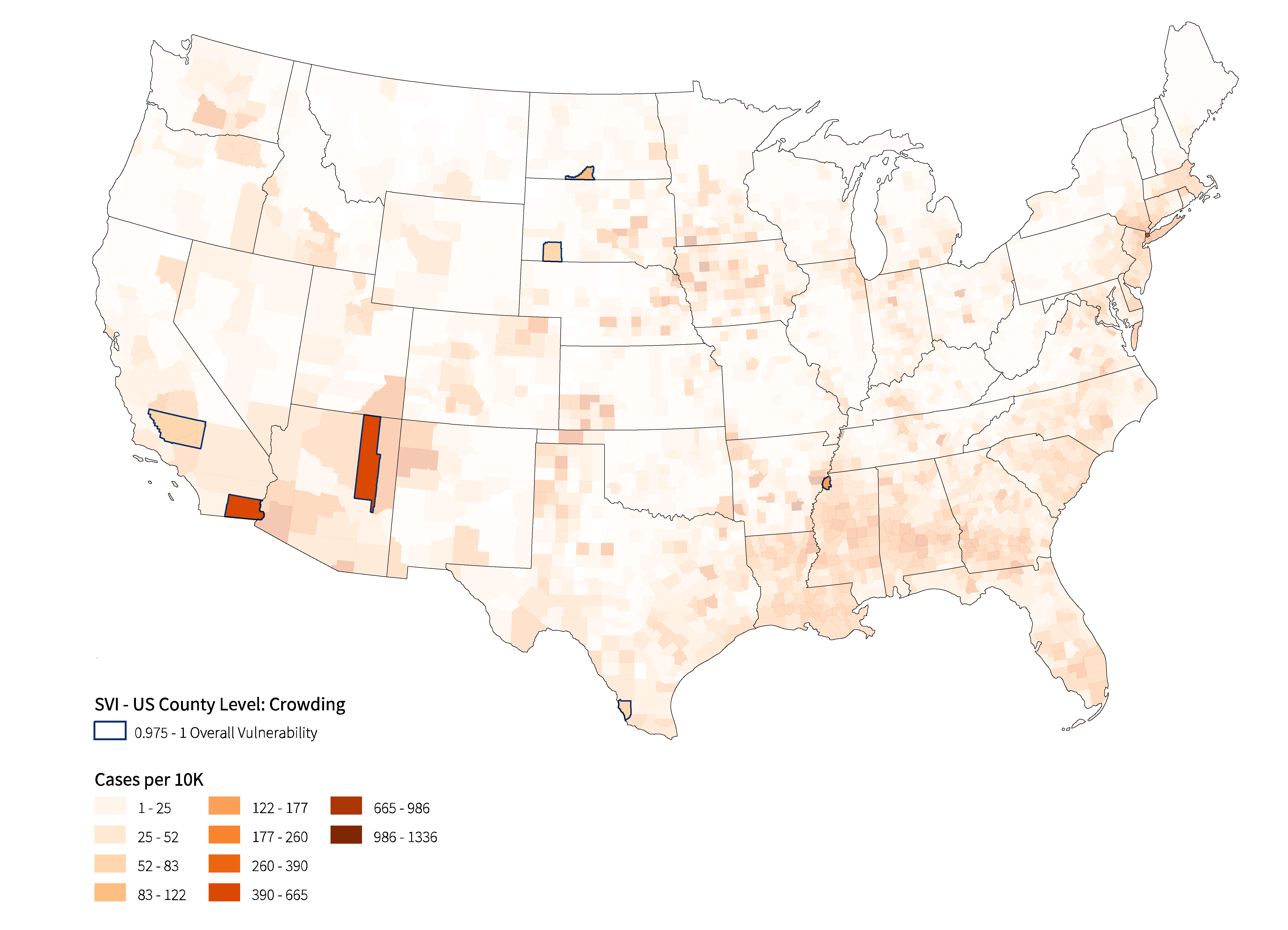
Plotting the Data: Overall SVI at County Level per State based on Crowding Vulnerability
 Source: CDC Social Vulnerability Index (SVI). Link to sources text of link.
Mapping: Overall SVI Crowding at County Level per State
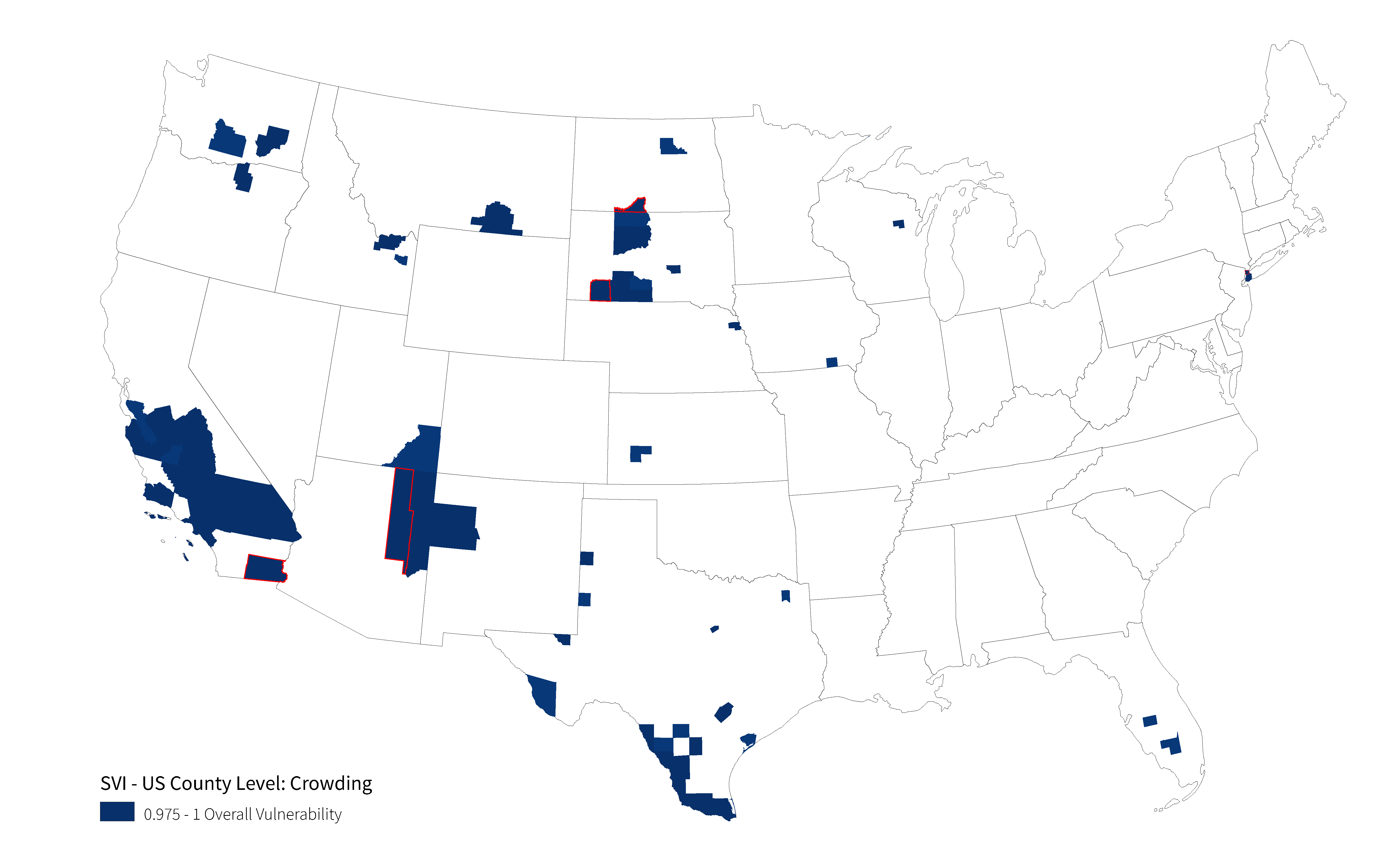
All of the counties and their crowding vulnerability is being plotted in the graph above. The map geolocates the counties that are most vulnerable based on the Crowding. Counties that have a vulnerability of 0.975 or higher are shown. Highlighted with the red outline are the counties with the highest vulnerability.
–
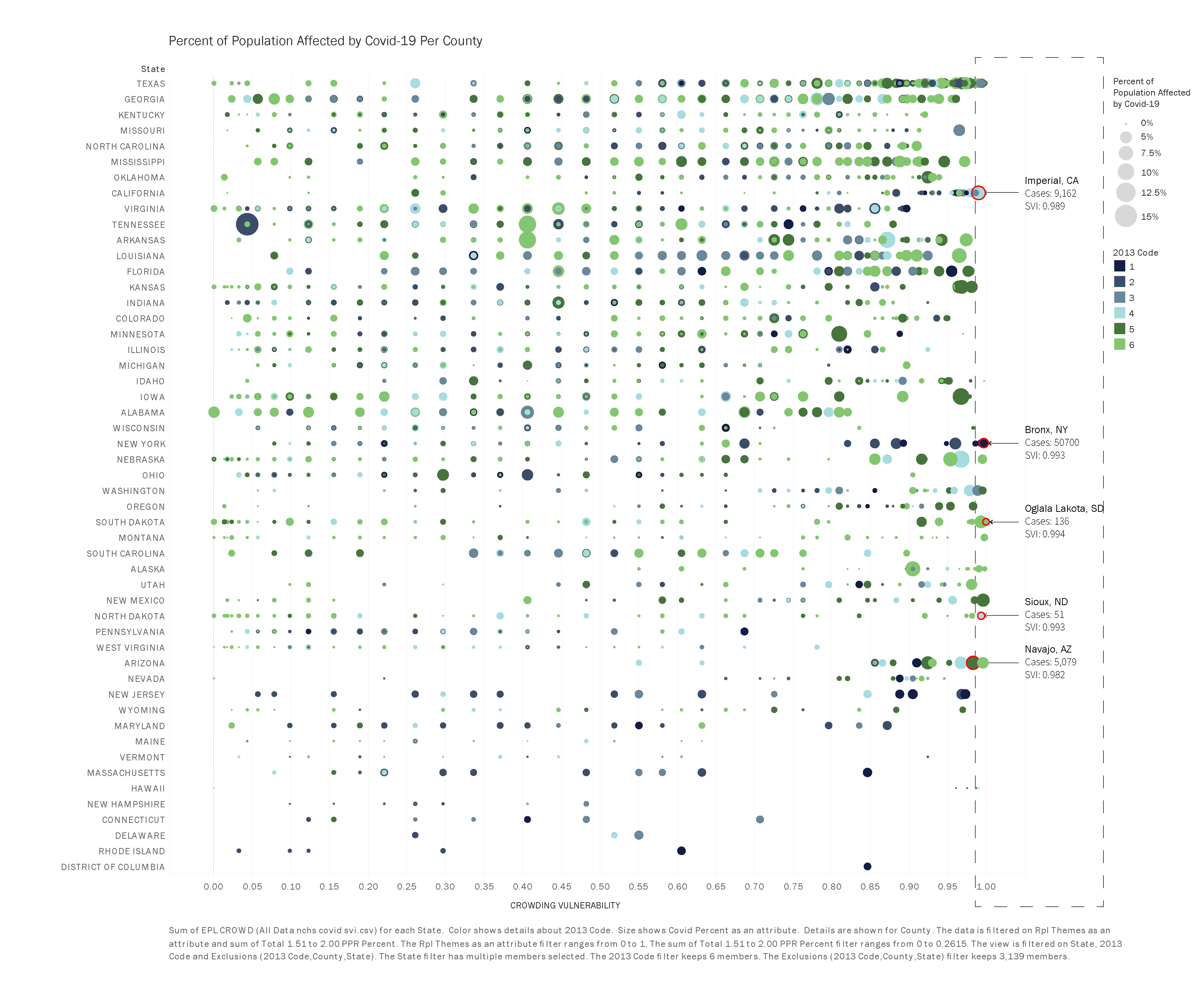
Plotting the Data: Covid-19 Cases Count Based on Shared of Population at County Level
 Source: CDC Social Vulnerability Index (SVI). Link to sources text of link.
–
Mapping: COVID-19 Case Count at County Level
 Source: NYT Covid_19 Data Count. Link to sources text of link.
All of the counties and their crowding vulnerability is being plotted in the graph above. The sizes of the circles represent the share of population of each county with COVID-19.
The color combination sequences of the three graphs above use six colors to identify under which National Center for Health Statistics(NCHS)/CDC classification each county falls. The six classifications are as follows:
- Large Metro
- Large Central Metro (1)
- Large Fridge Metro (2)
- Medium Metro (3)
- Small Metro (4)
- Micropolitan (5)
- Noncore (6)
Source: National Center for Health Statistics(NCHS)/CDC. Link to sources text of link.
–
Social Vulnerability Index (SVI) Breakdown at Census Tract Level
Understanding the underlying conditions that lead to underhoused households and crowding vulnerability is dependent on identifying the location of high concentrations of said vulnerability. The census tract breakdown will help build a more accurate picture of crowding vulnerability within a county. This data will be enhanced by satellite imagery to locate population clusters and identify some of its physical characteristics.
Methodology: Part 2: For this analysis, correlations between high crowding and Covid-19 case rates will be the main criteria taken into account when describing and comparing counties and census tracts. Urban and rural counties will be compared down to census tract level and counties with the same NCHS/CDC classification. The census tract identification is as follows:
- County Breakdown into Census Tract Level:
- Using the Crowding Social Factor vulnerability:
- What census tract is most vulnerable based on crowding?
- What are the population centers within the census tract?
- Overlapping with Covid-19 case count data. Depending on availability.
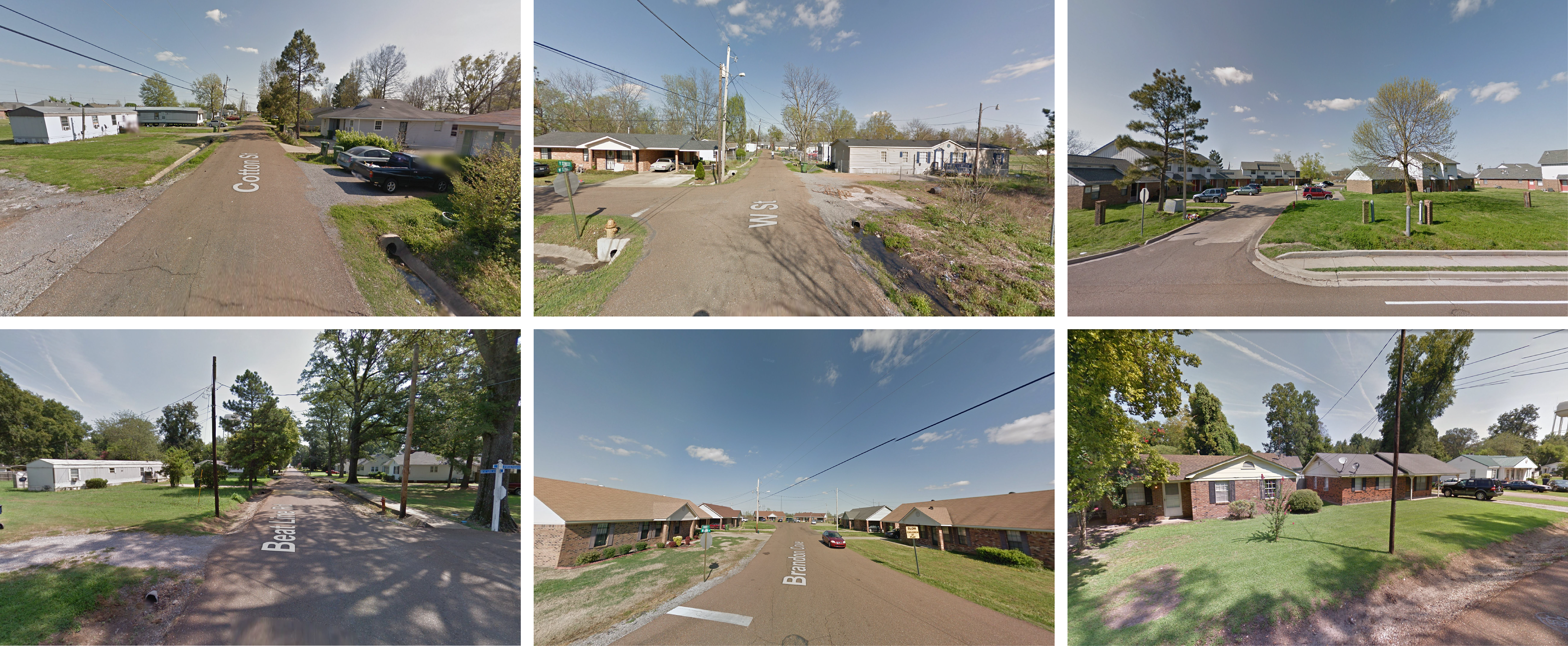
- Satellite Imagery
- Population Clusters
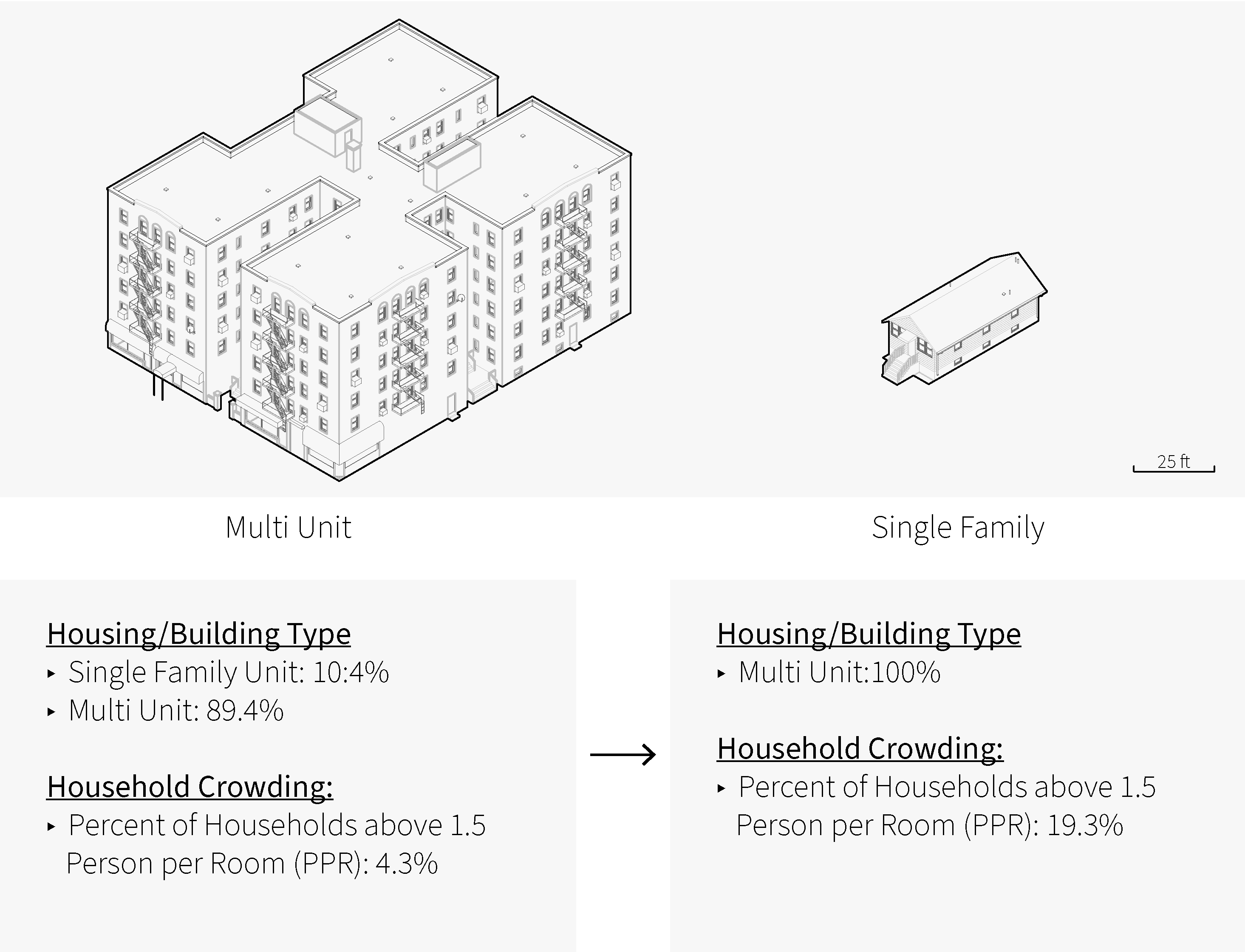
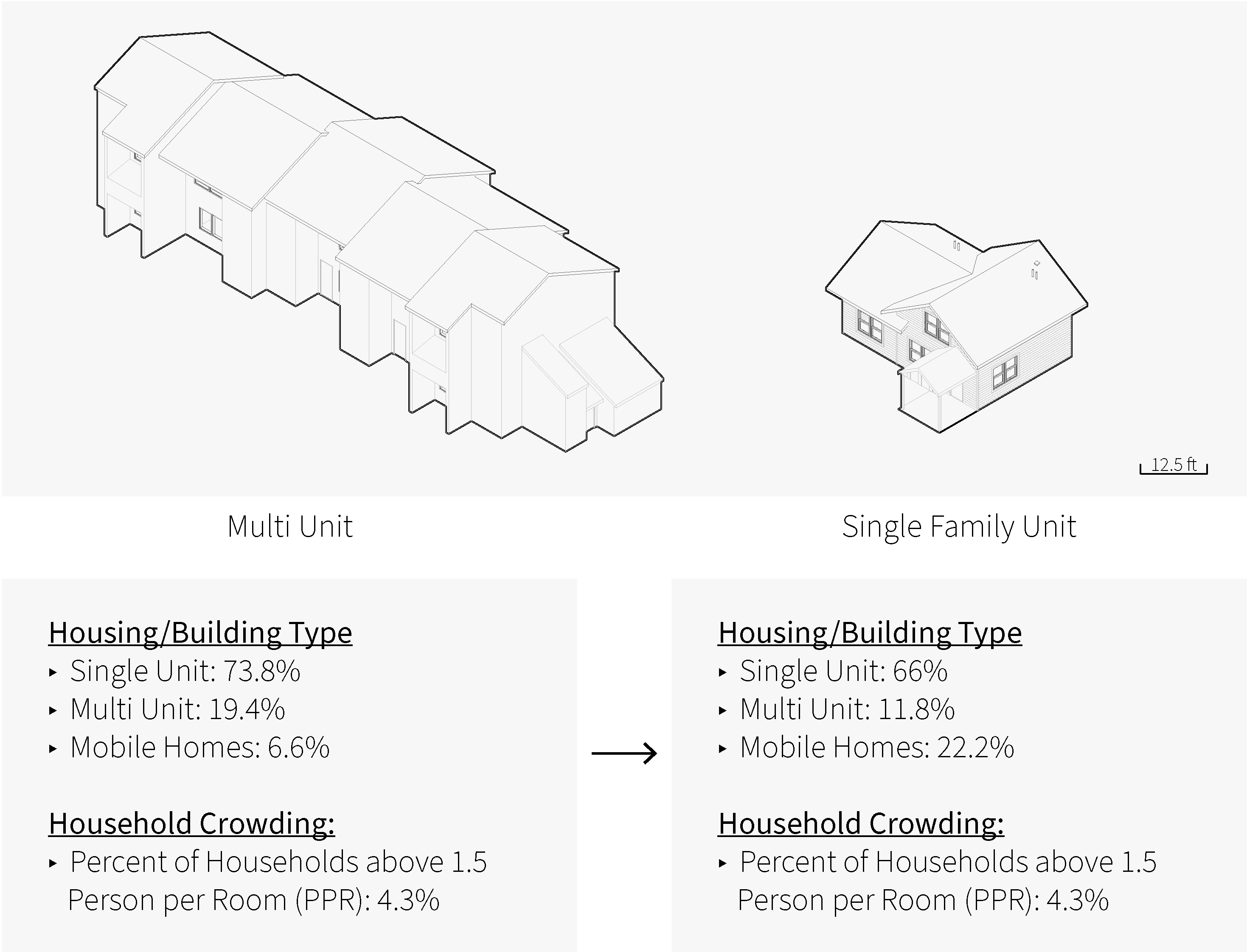
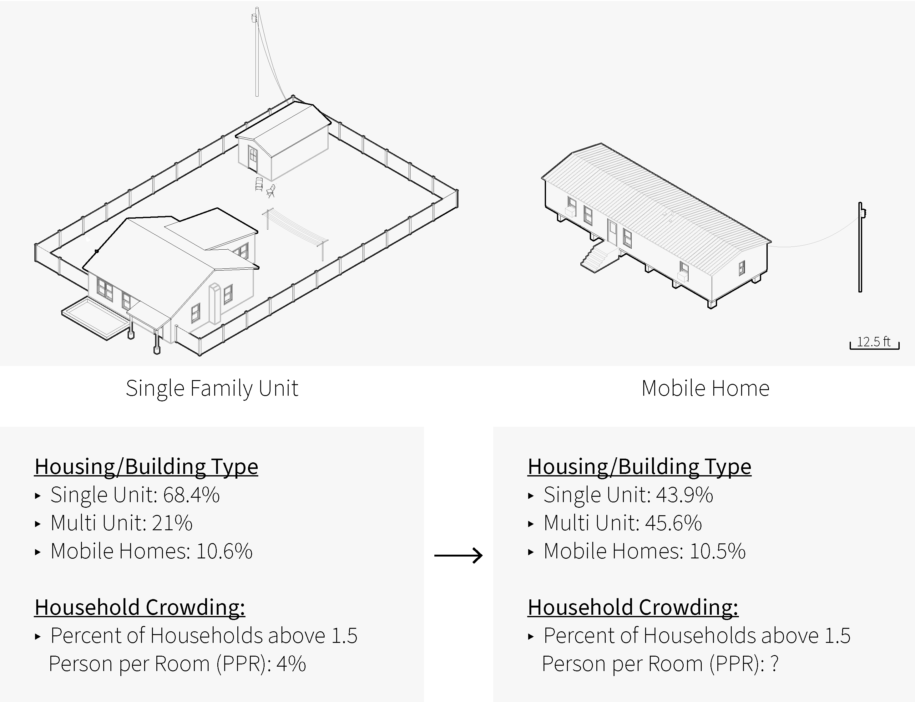
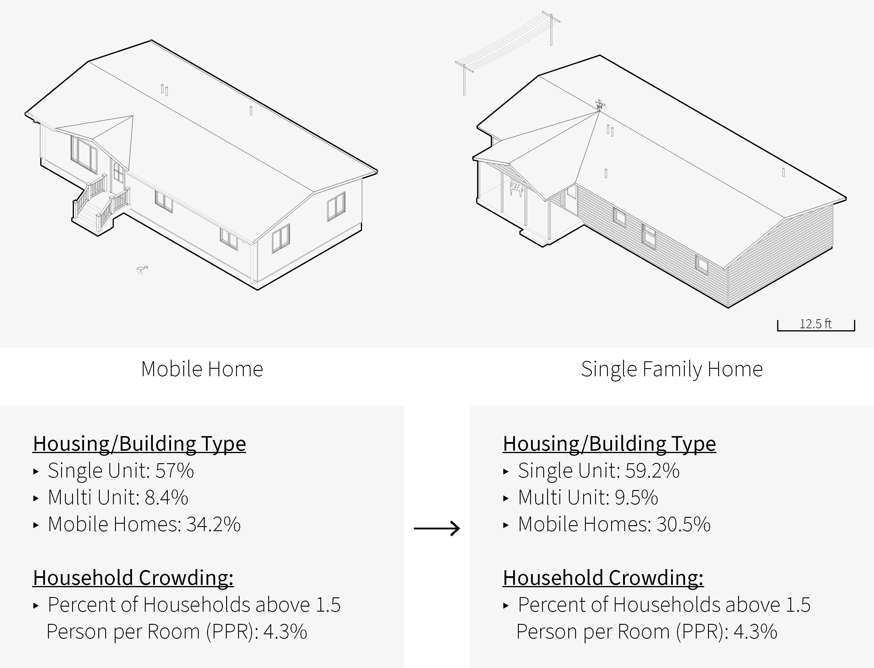
- Potential Housing Typology: The CDC considers mobile homes and multi-unit structures (10 or more units) a point of vulnerability
- Household composition?
- Demographics
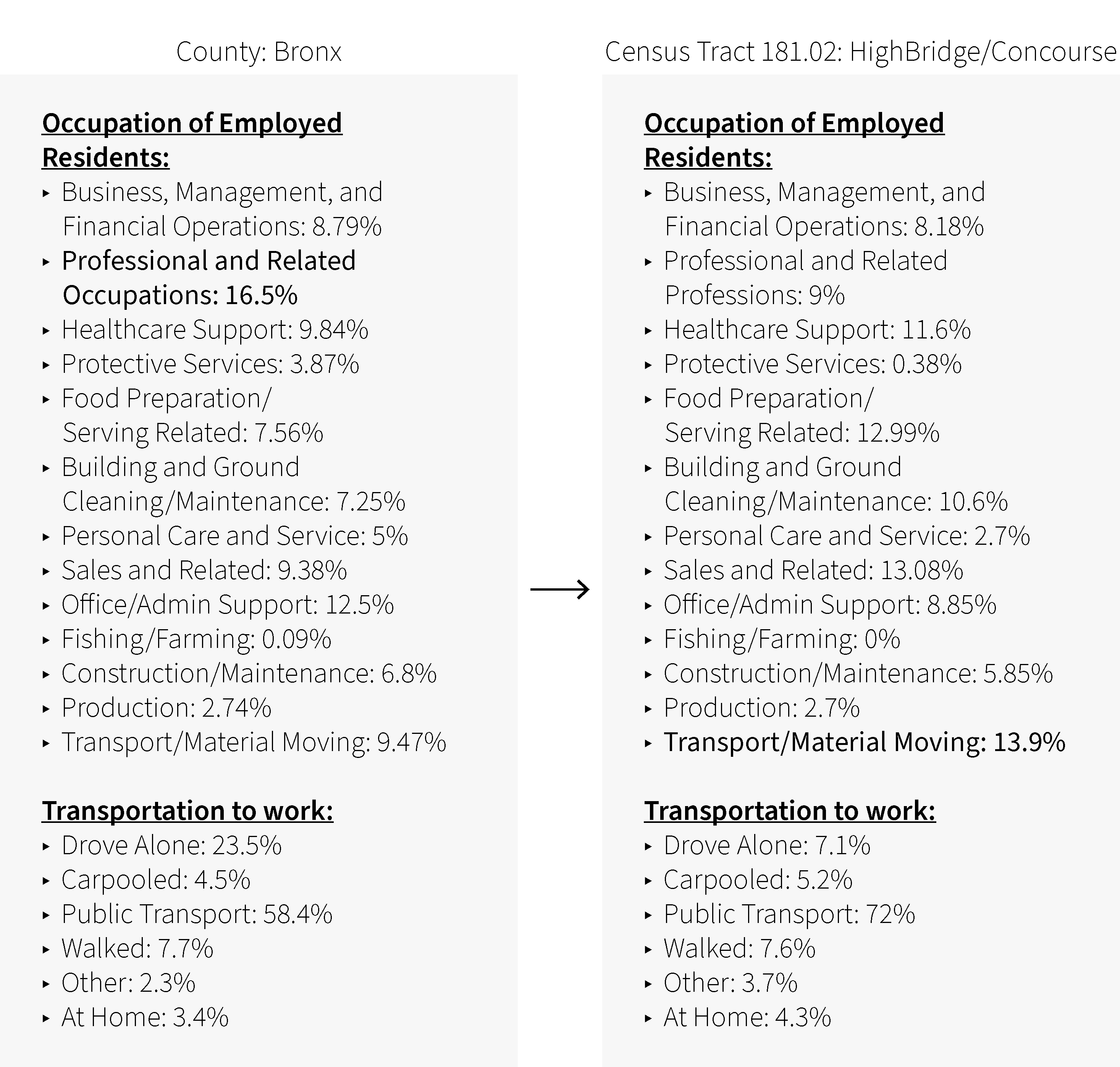
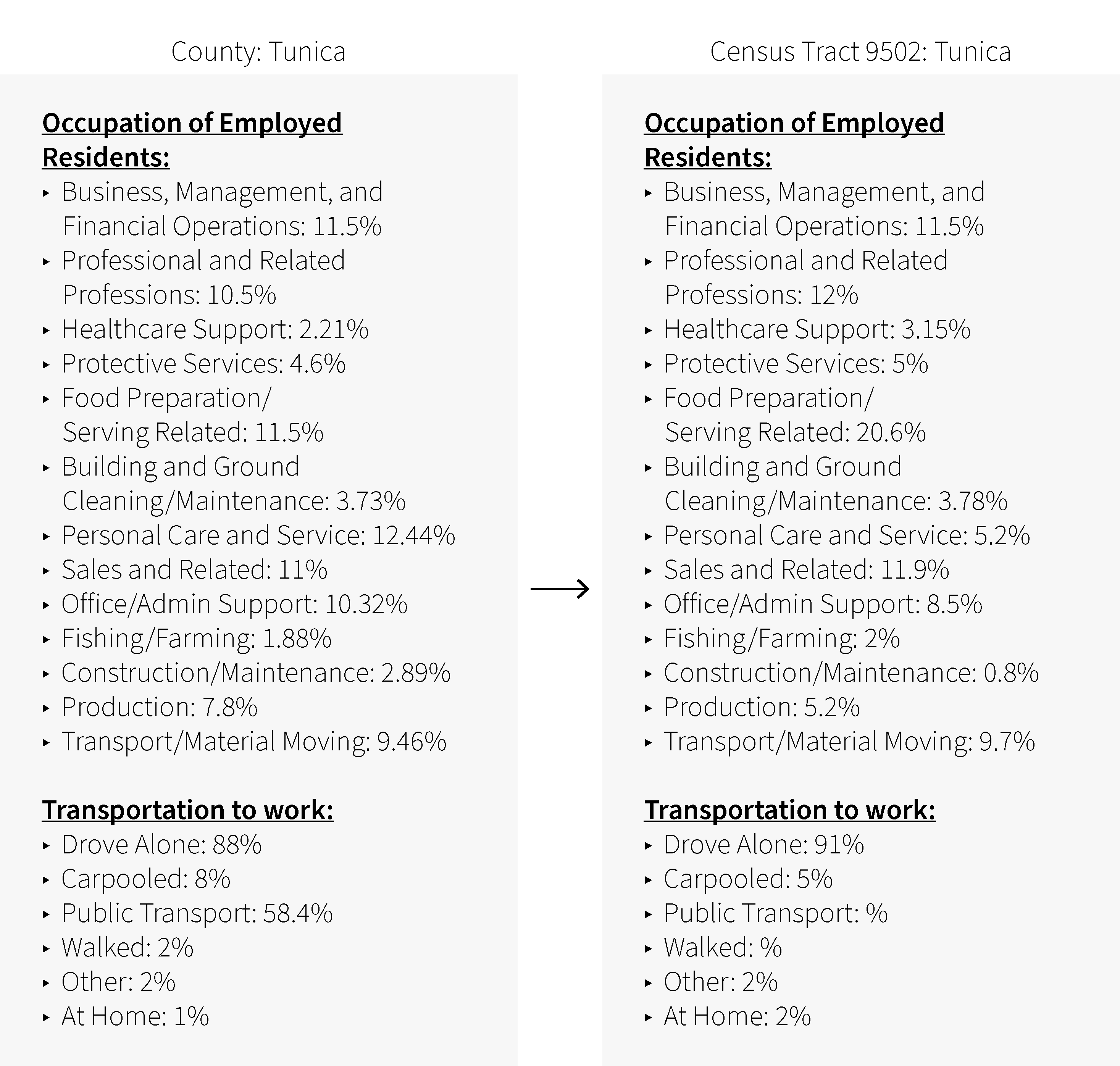
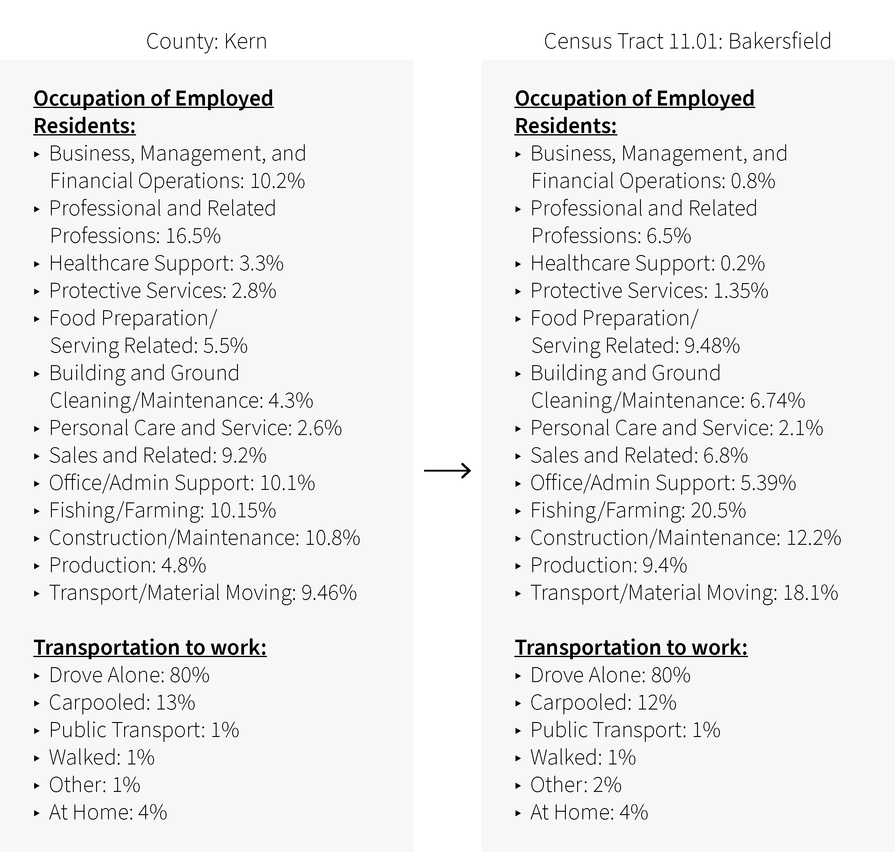
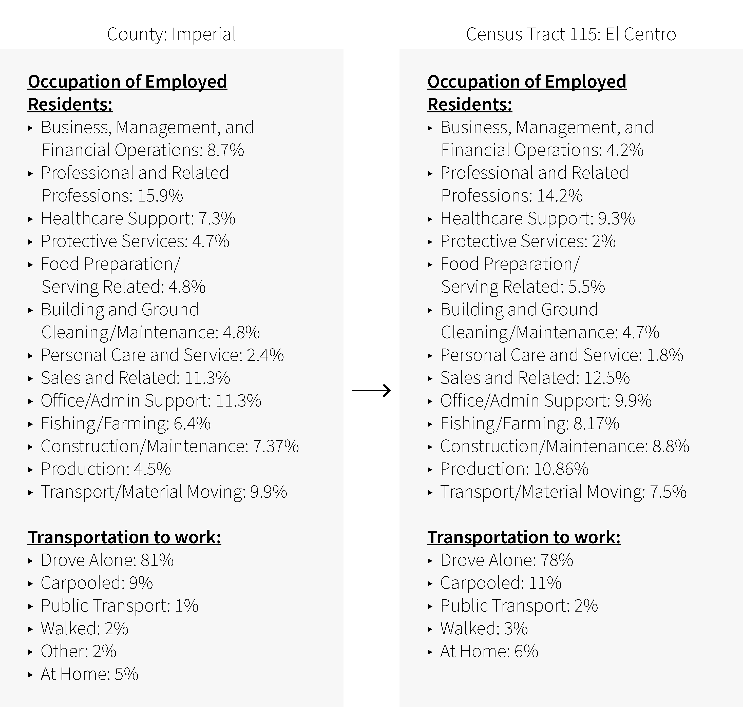
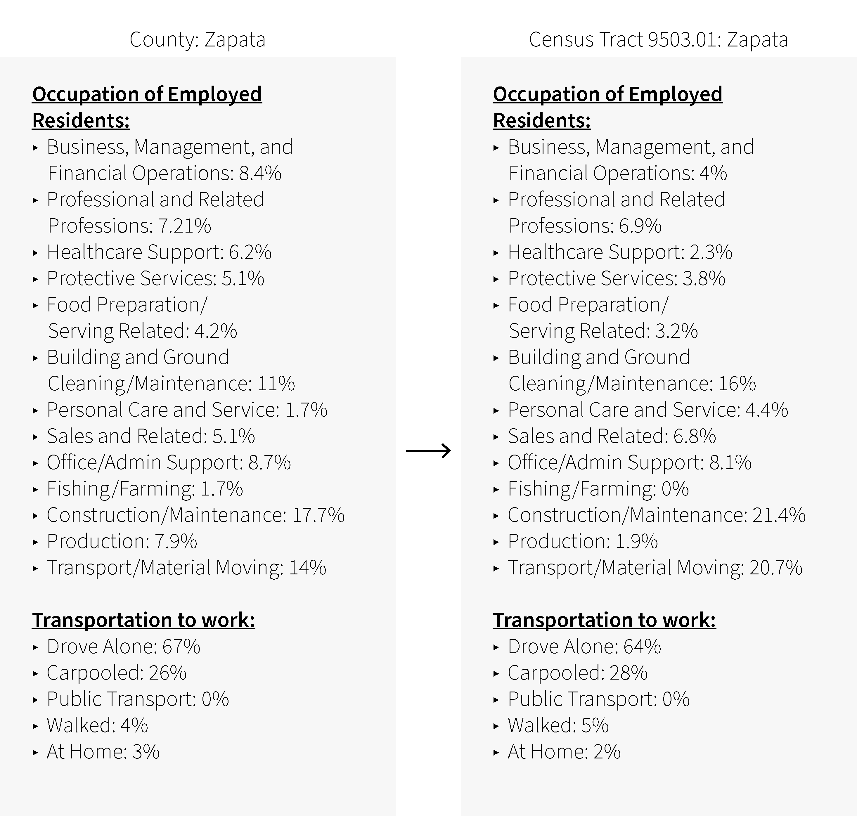
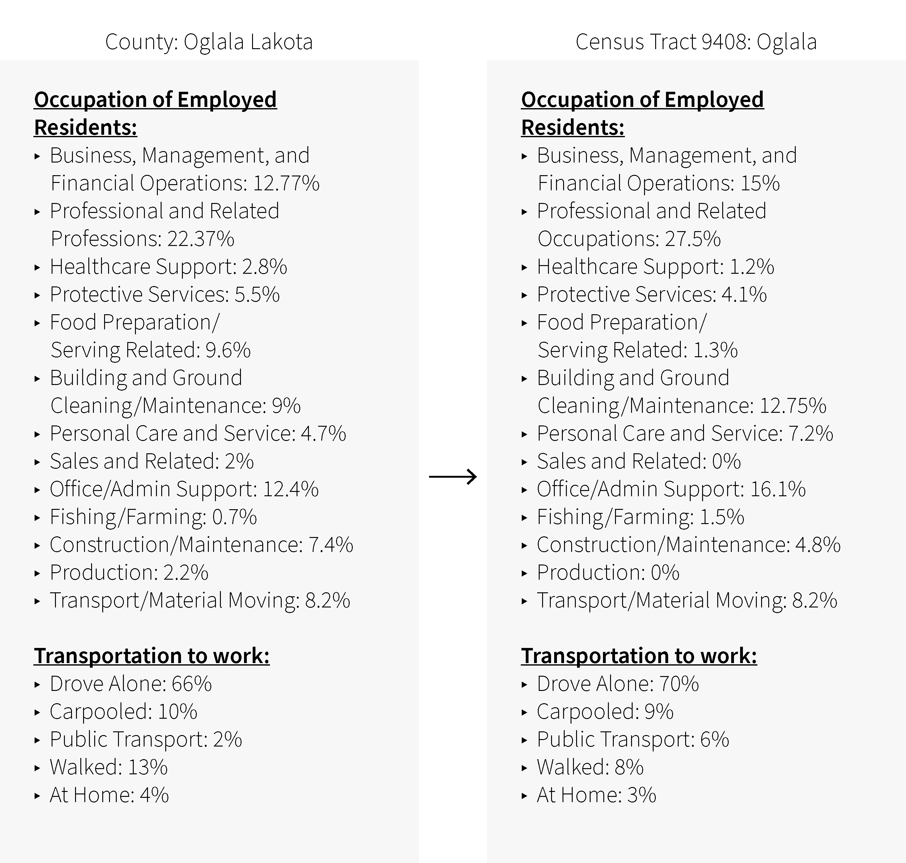
- Industry: What is the most prevent employment industry?
- The crowding vulnerability indicators to be used include:
- Housing type
- Transportation mode
- Industry
- Covid-19 Count/Share of Population
- Household Size
- Household Occupancy per Room
- Current news stories that help connect these indicators
- Once at street level, observing to potentially identify patterns.
Counties with Highest Crowding Vulnerability
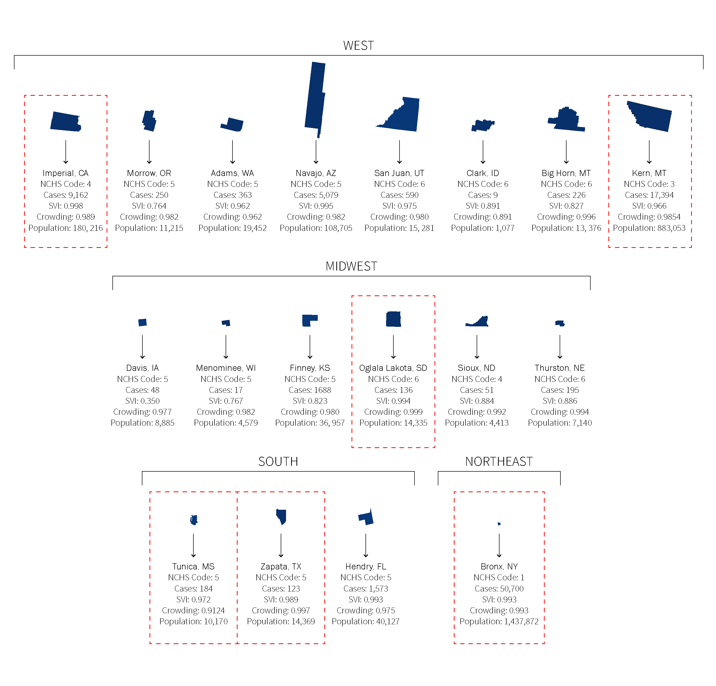
The list of counties above are the most vulnerable based on the Crowding Social Factor from the Social Vulnerability Index (SVI). Six (6) of these counties were selected to break down to the census tract level to identify where crowding vulnerability is located. As described above, high crowding and Covid-19 case rates were considered the main vulnerability indicators to select these counties.
–
NCHS/CDC Classification: 1
Site 1: Bronx County, NY
Household crowding in New York City has been an issue that has worsened over the last decade. A report released by the city’s comptroller’s office in October 2015 details crowding conditions in each of the five boroughs, increasing 15.8 percent city-wide between 2005 and 2013. The Bronx was the borough (county) with the most crowded households, with 12.4 percent of its housing units being crowded.
Based on the overall Social Vulnerability Index (SVI), crowding conditions, and Coronavirus infections, Bronx County is the most vulnerable county. Within this borough, Highbridge/Concourse Village was one of the most affected community districts by the Covid-19 based on antibody result data released by the NYC Health Department. It also has some of the highest levels of crowding vulnerability at the census tract level. Below is a case study that compares county and census tract vulnerability.
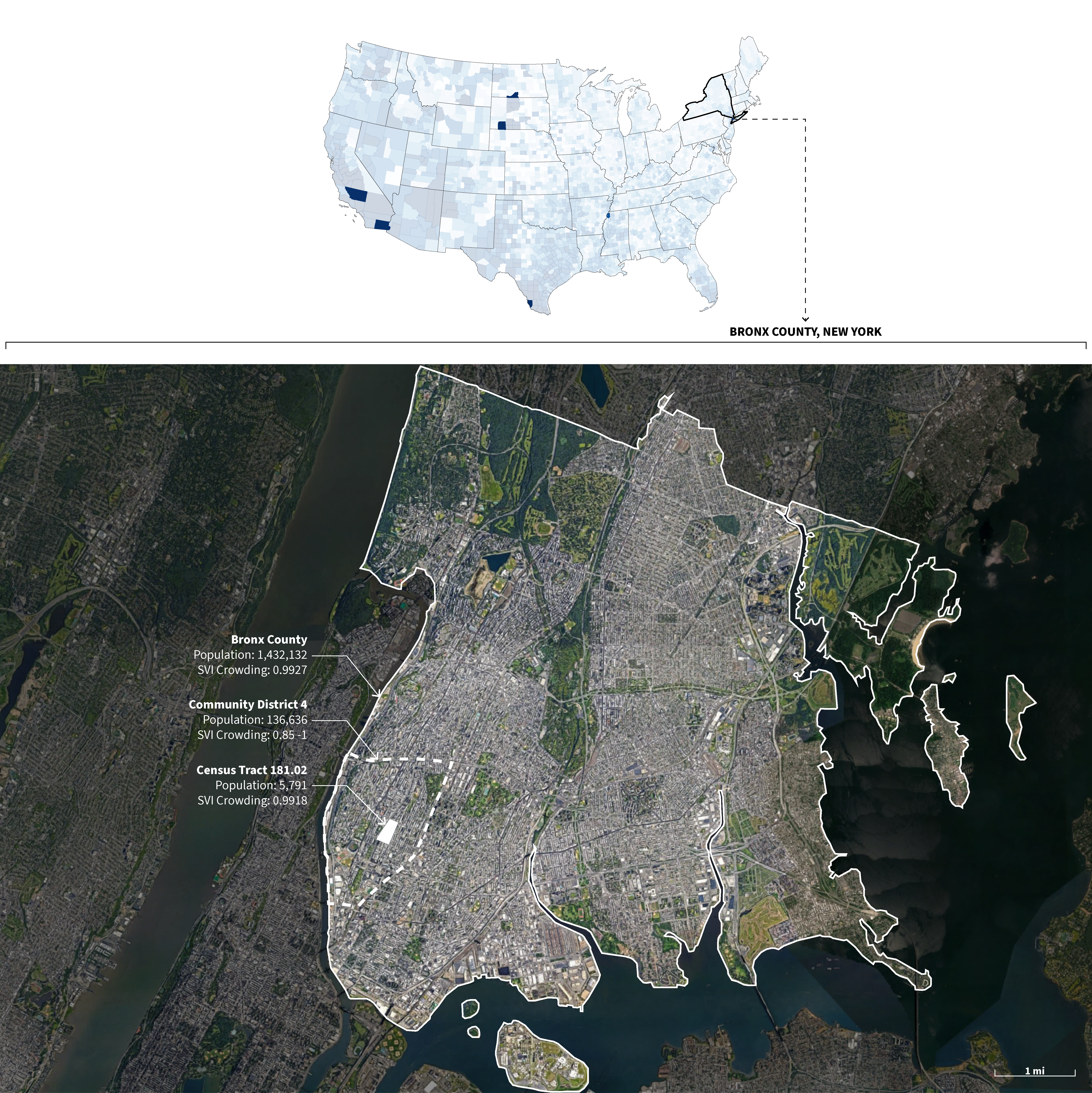
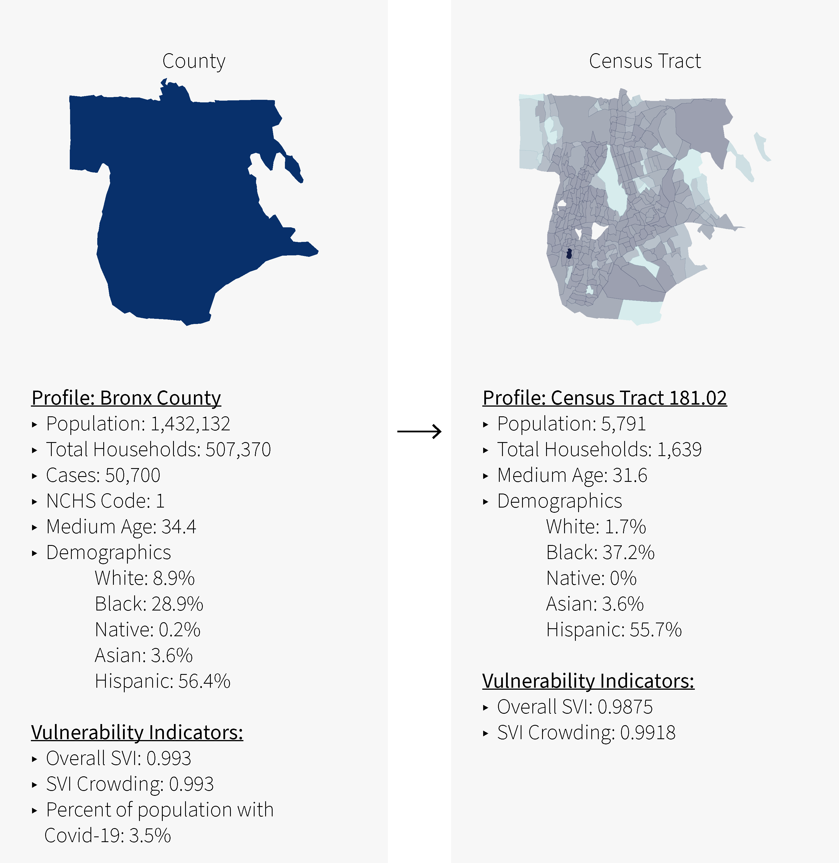
Census Tract
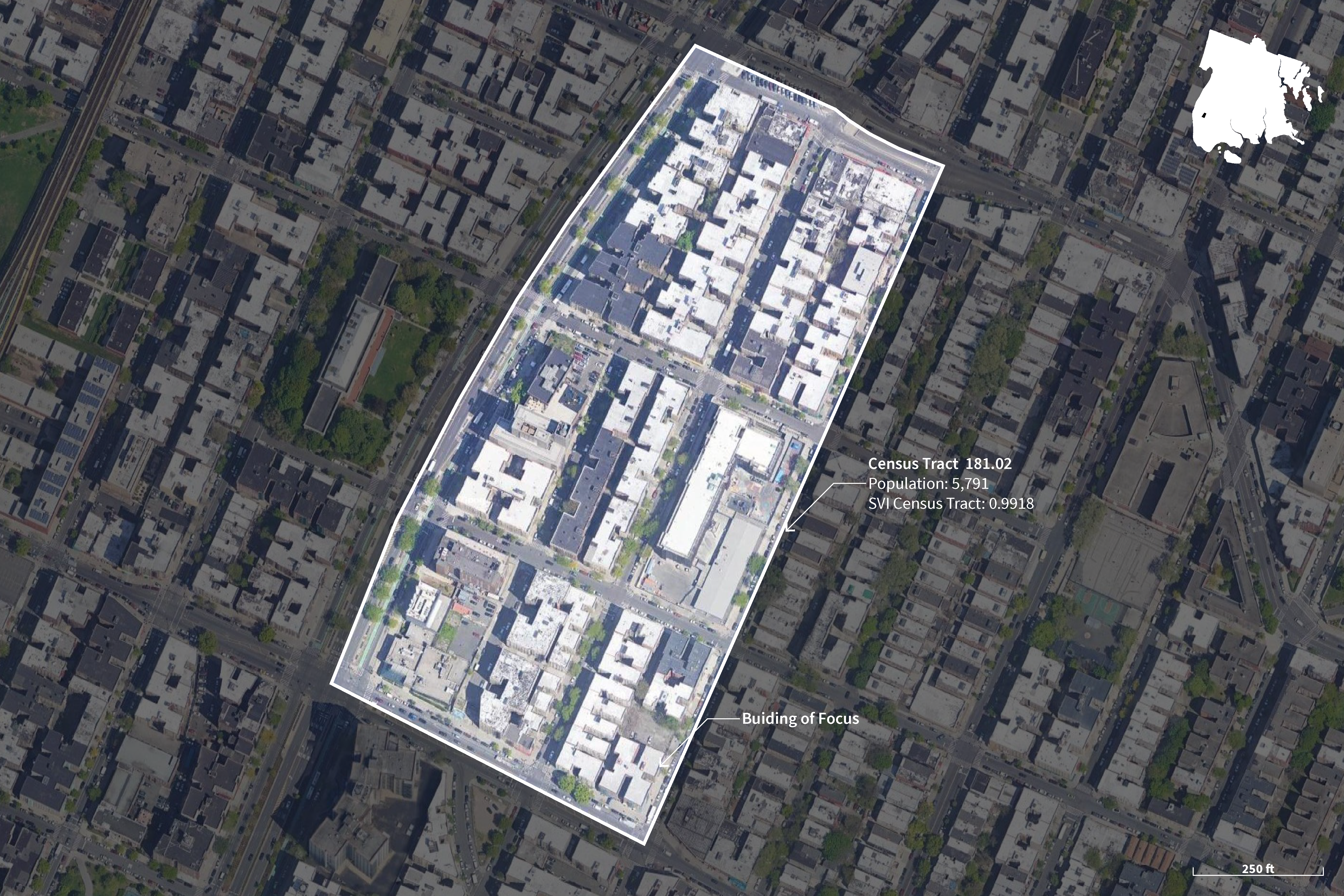
Satellite Images on Site
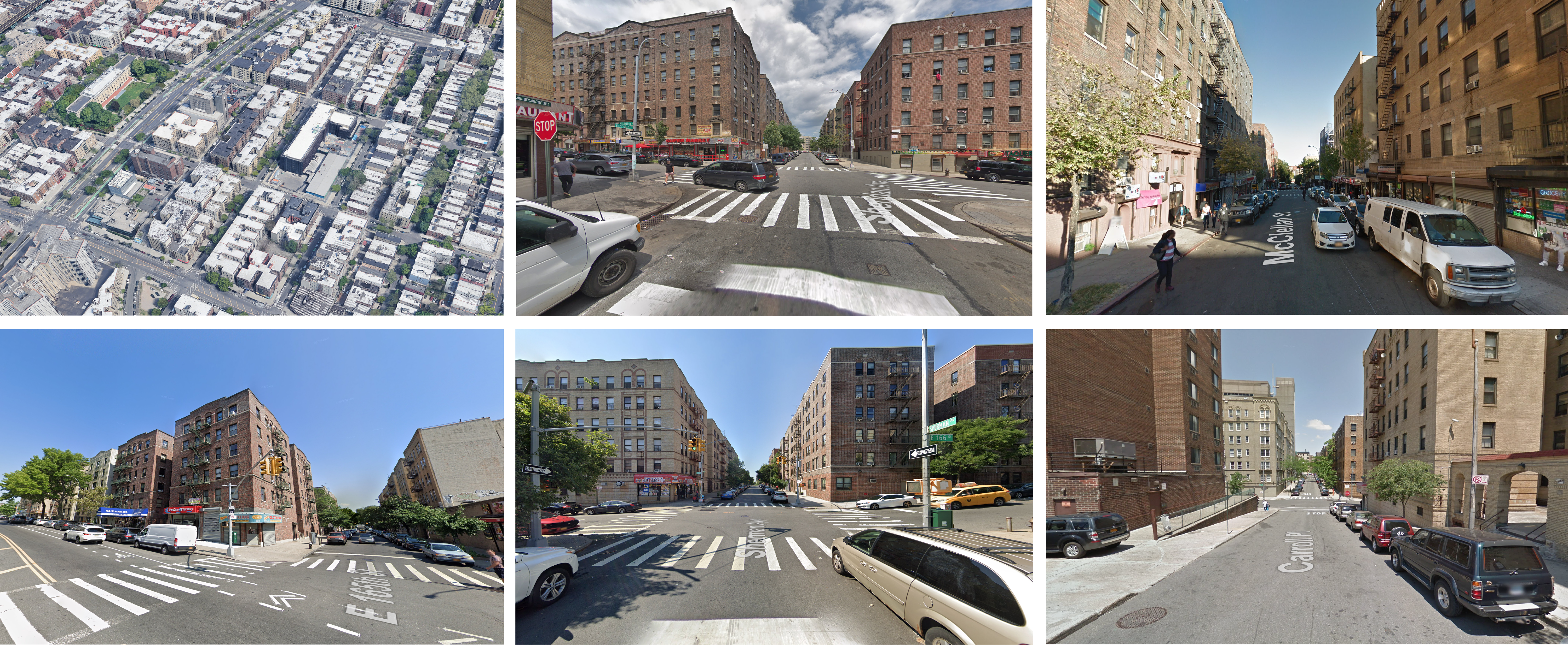
The site above is representative of Large Central Metro (1) based on the National Center for Health Statistics(NCHS)/CDC classification.
–
NCHS/CDC Classification: 2
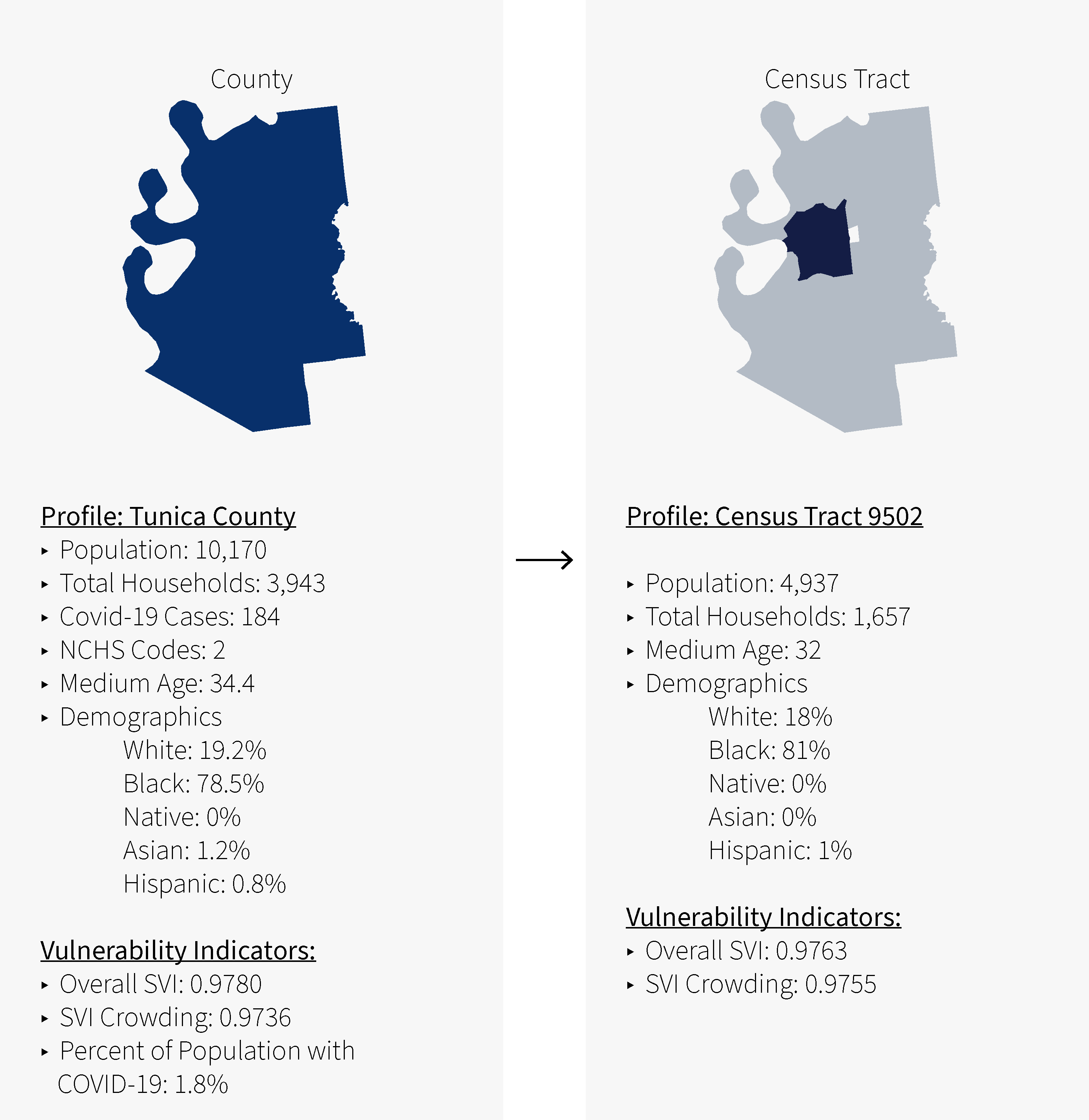
Site 2: Tunica County, MS
Tunica County is the most vulnerable county in terms of overall SVI (0.9720) and crowding (0.9124) with a National Center for Health Statistics(NCHS)/CDC classification of Large Fridge Metro (2). This county experiences less crowding than others compared in this analysis, however, as a county in the middle of the Lower Mississippi Delta with a majority black population. It represents a different demographic breakdown that is not as represented in the other counties. Below is a case study that compares county and census tract vulnerability.
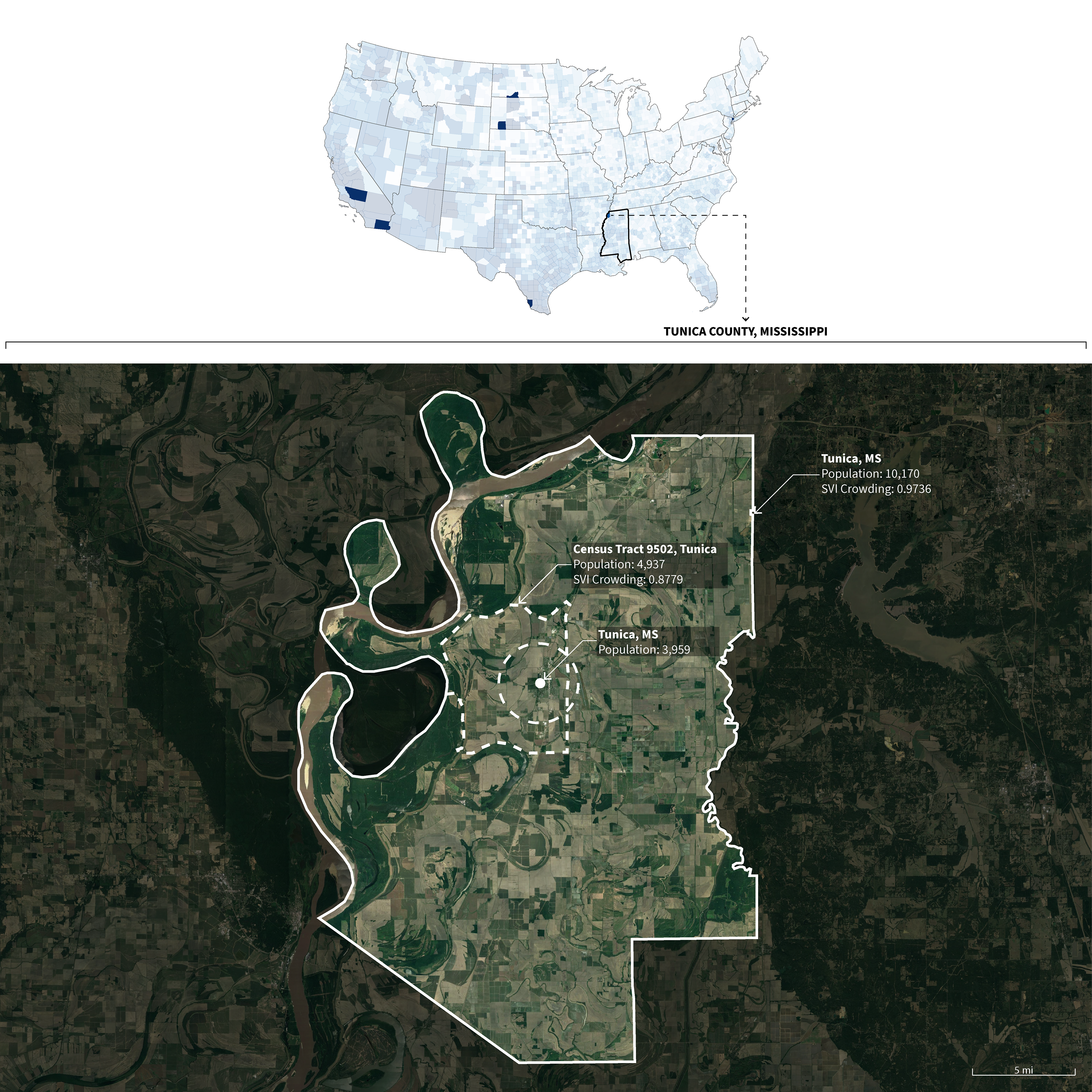
Census Tract
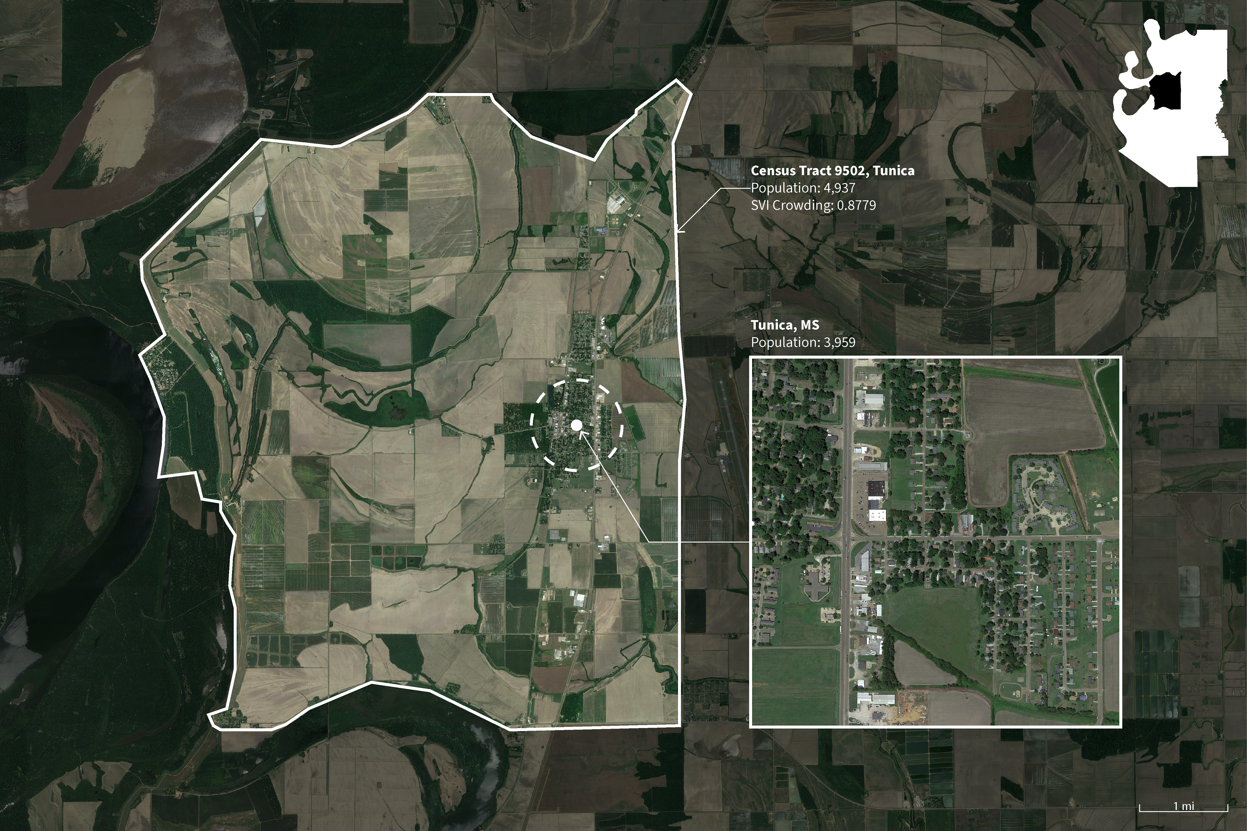
Satellite Images on Site
The site above is representative of Large Fridge Metro (2) based on the National Center for Health Statistics(NCHS)/CDC classification.
–
NCHS/CDC Classification: 3
Site 2: Kern County, CA
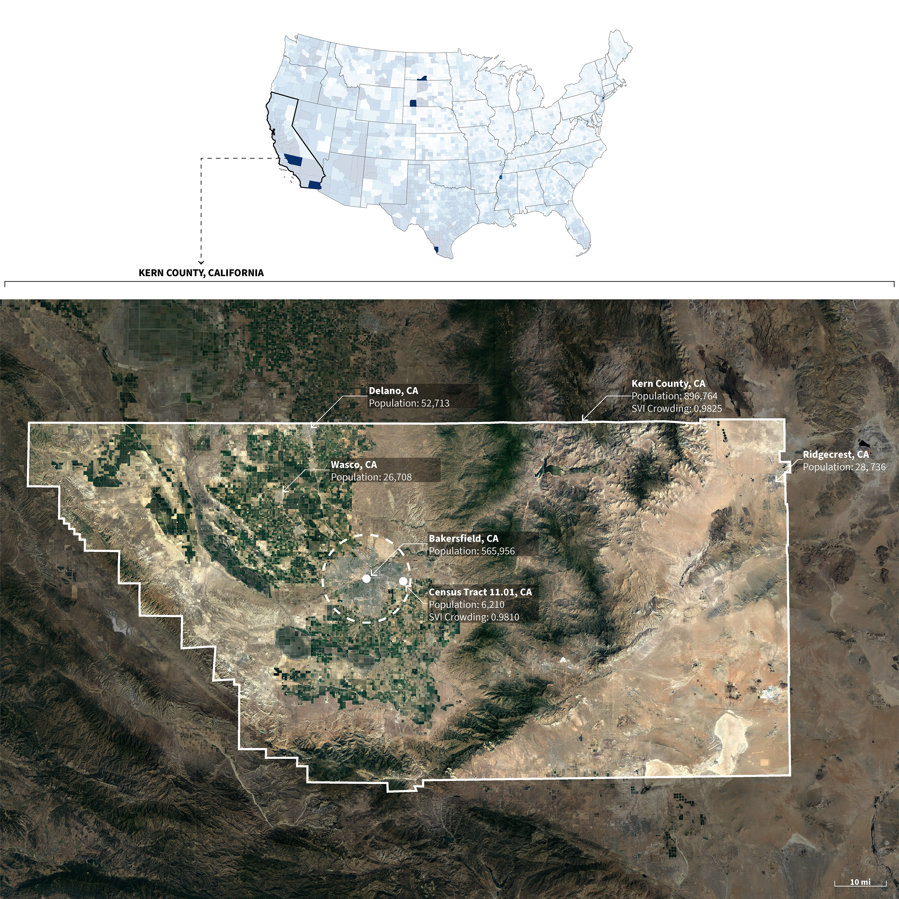
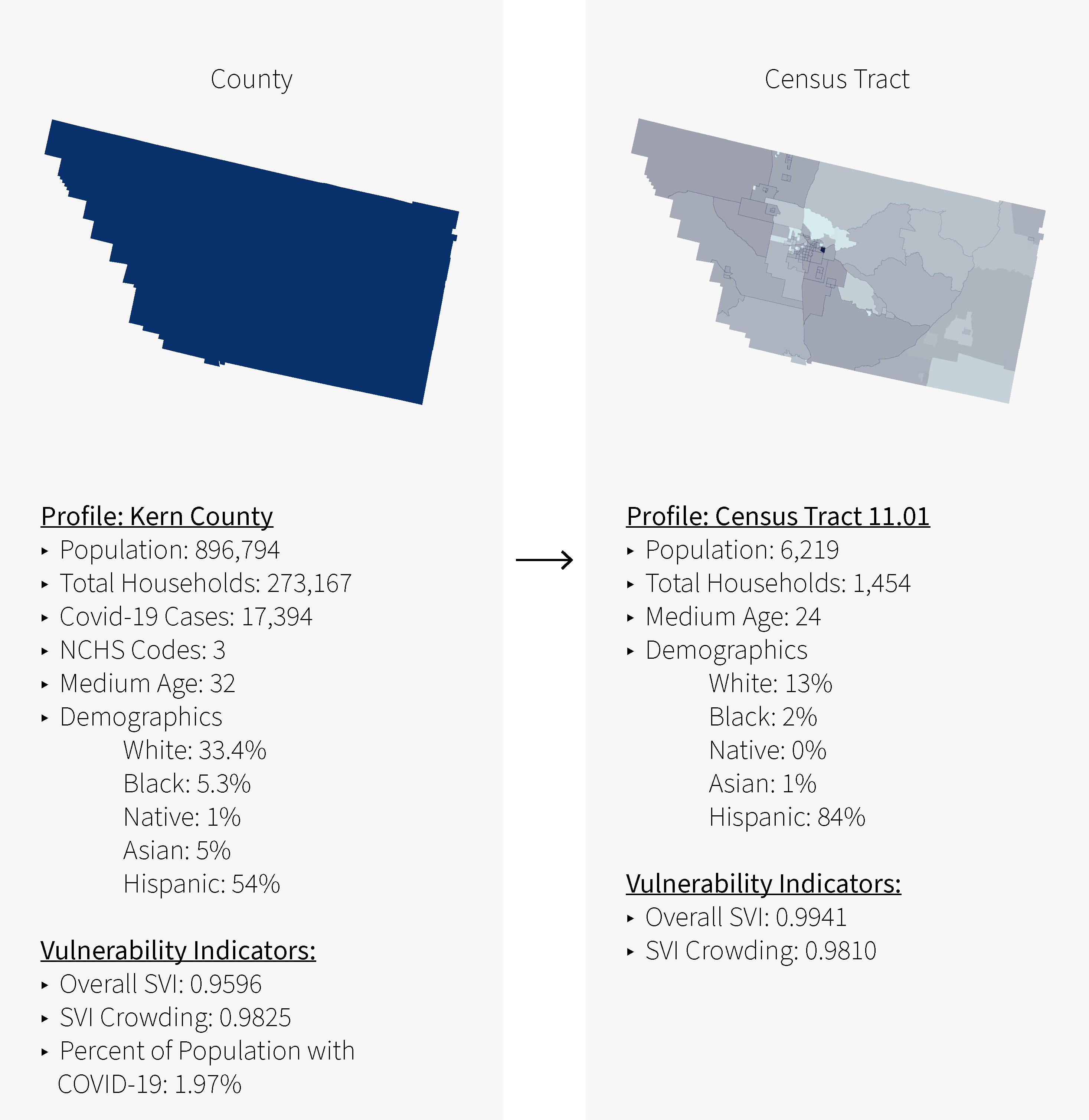
Census Tract
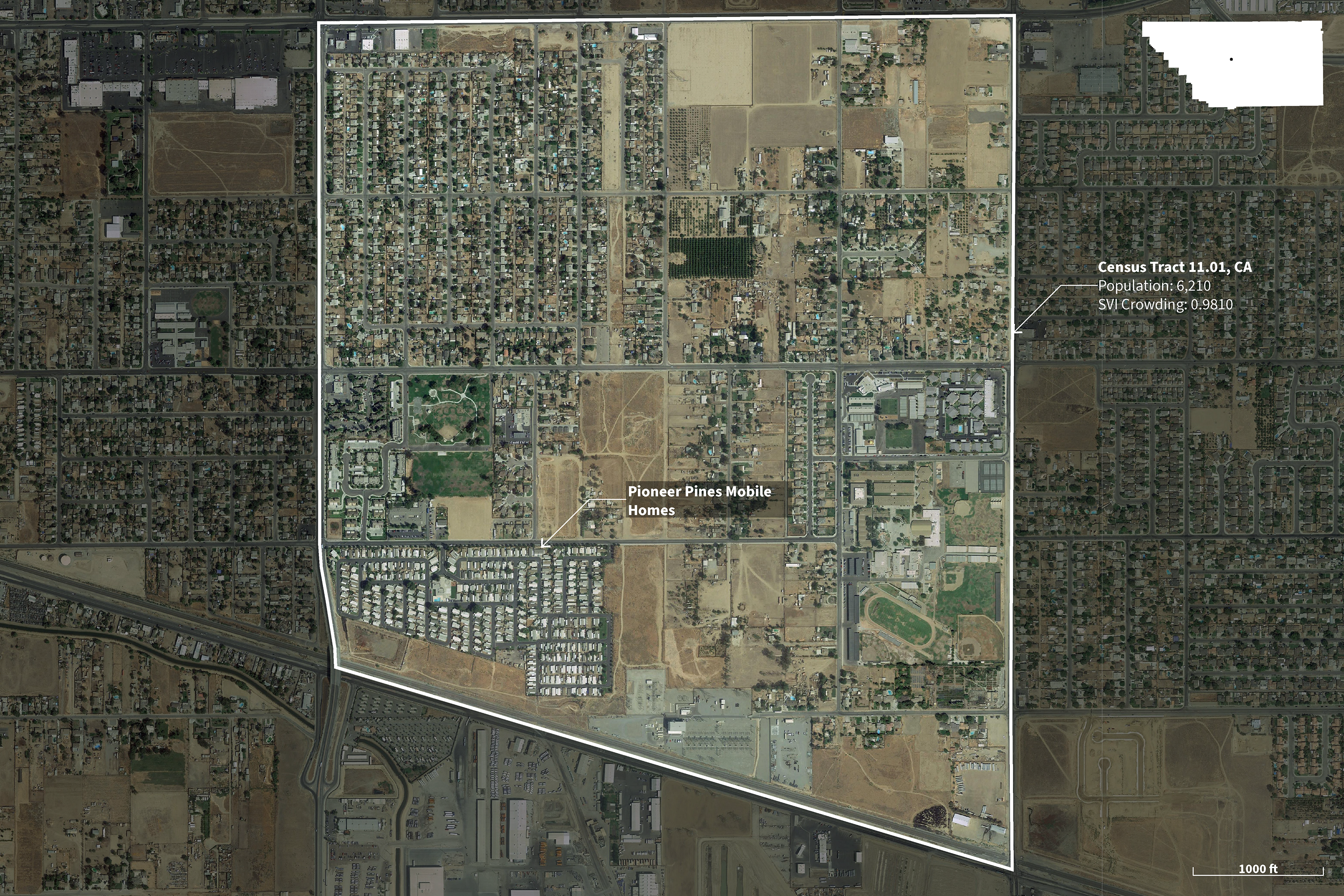
Satellite Images on Site
The site above is representative of Medium Metro (3) based on the National Center for Health Statistics(NCHS)/CDC classification.
–
NCHS/CDC Classification: 4
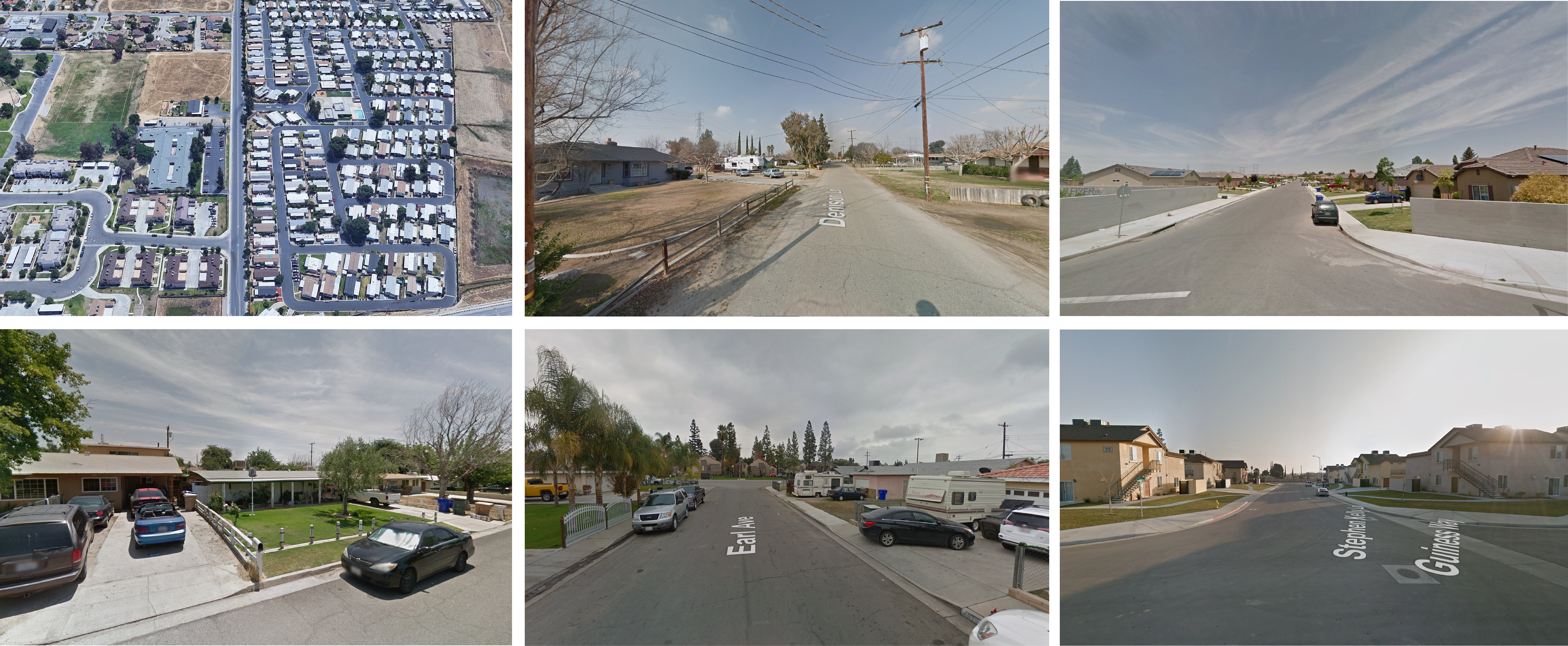
Site 2: Imperial County, CA
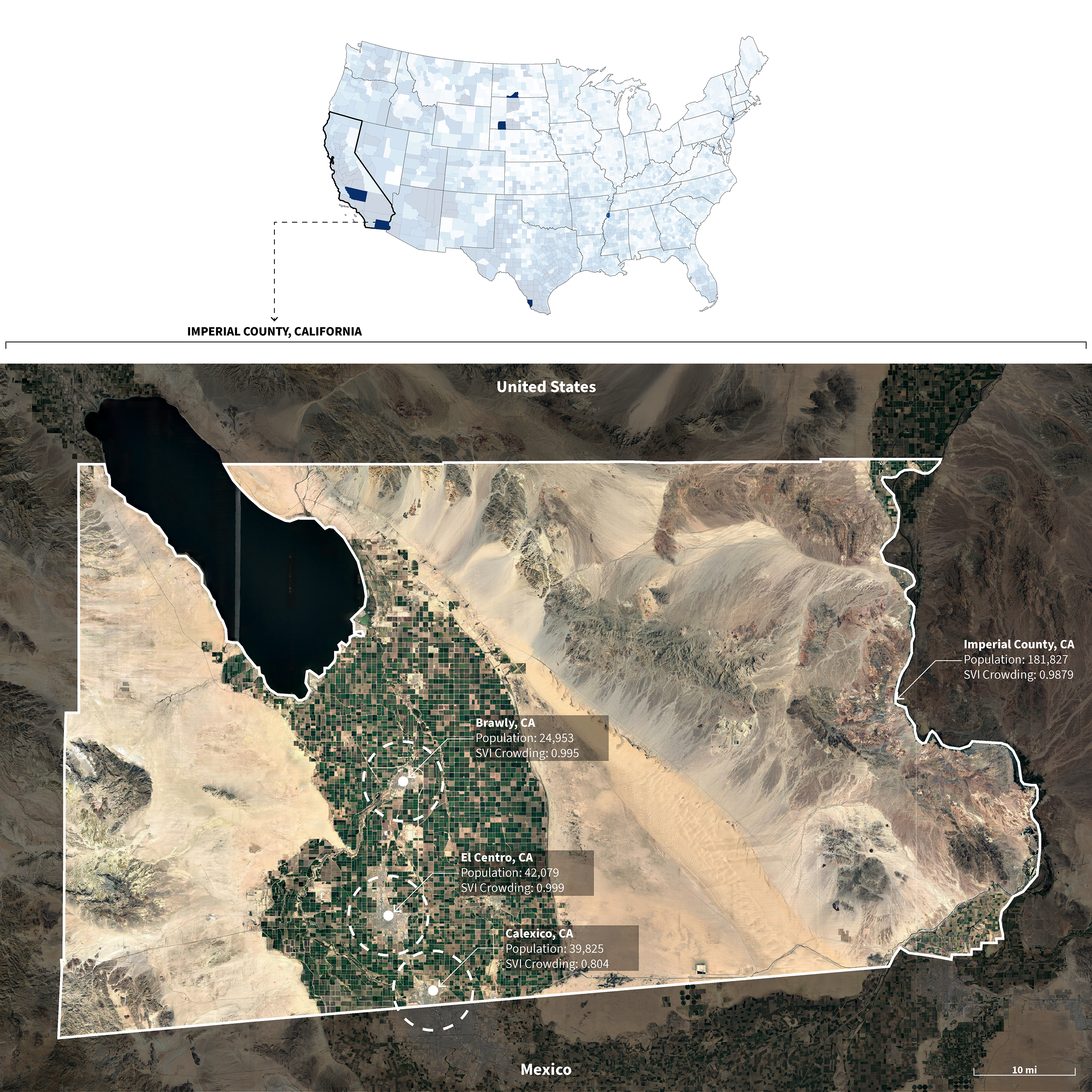
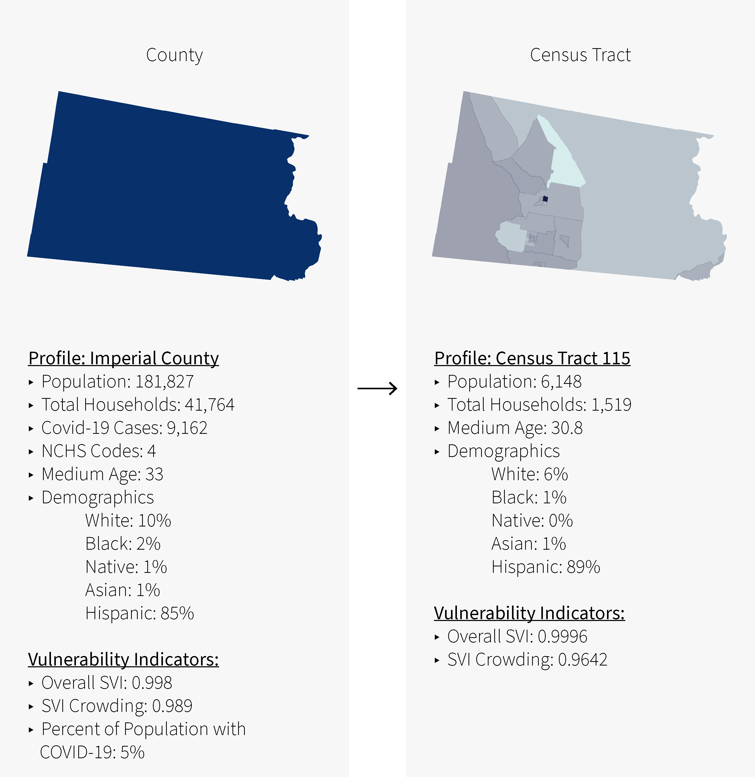
Census Tract
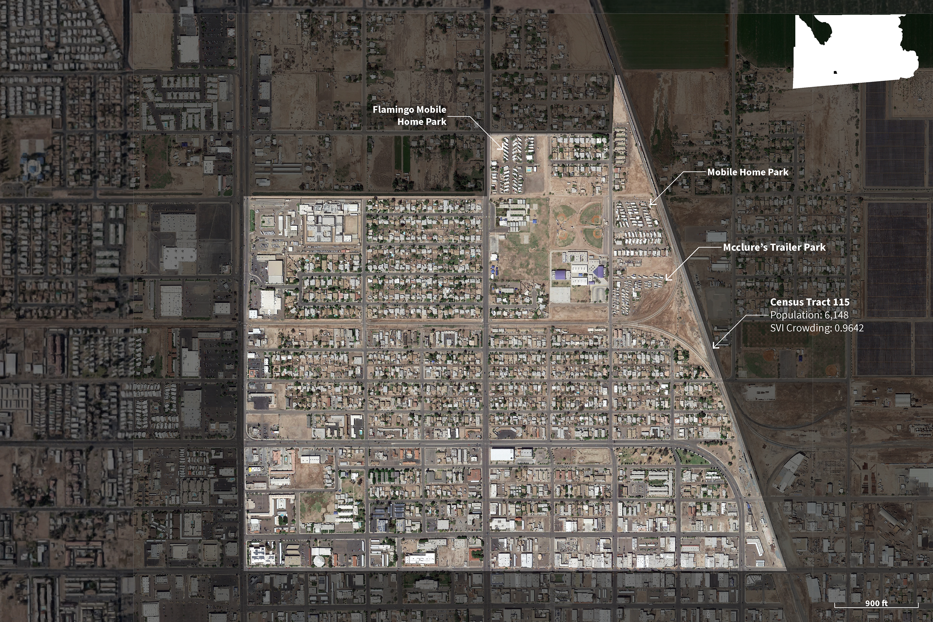
Satellite Images on Site
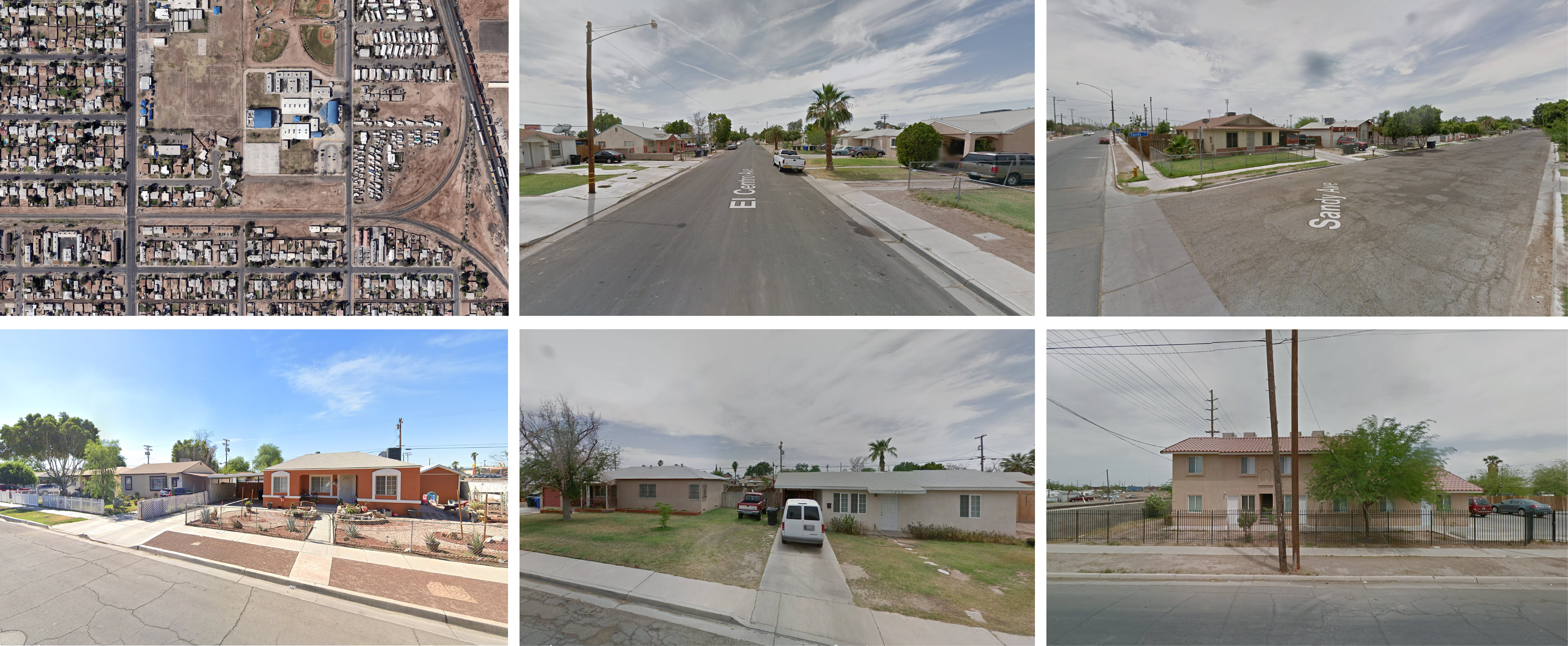
The site above is representative of Small Metro (4) based on the National Center for Health Statistics(NCHS)/CDC classification.
–
NCHS/CDC Classification: 5
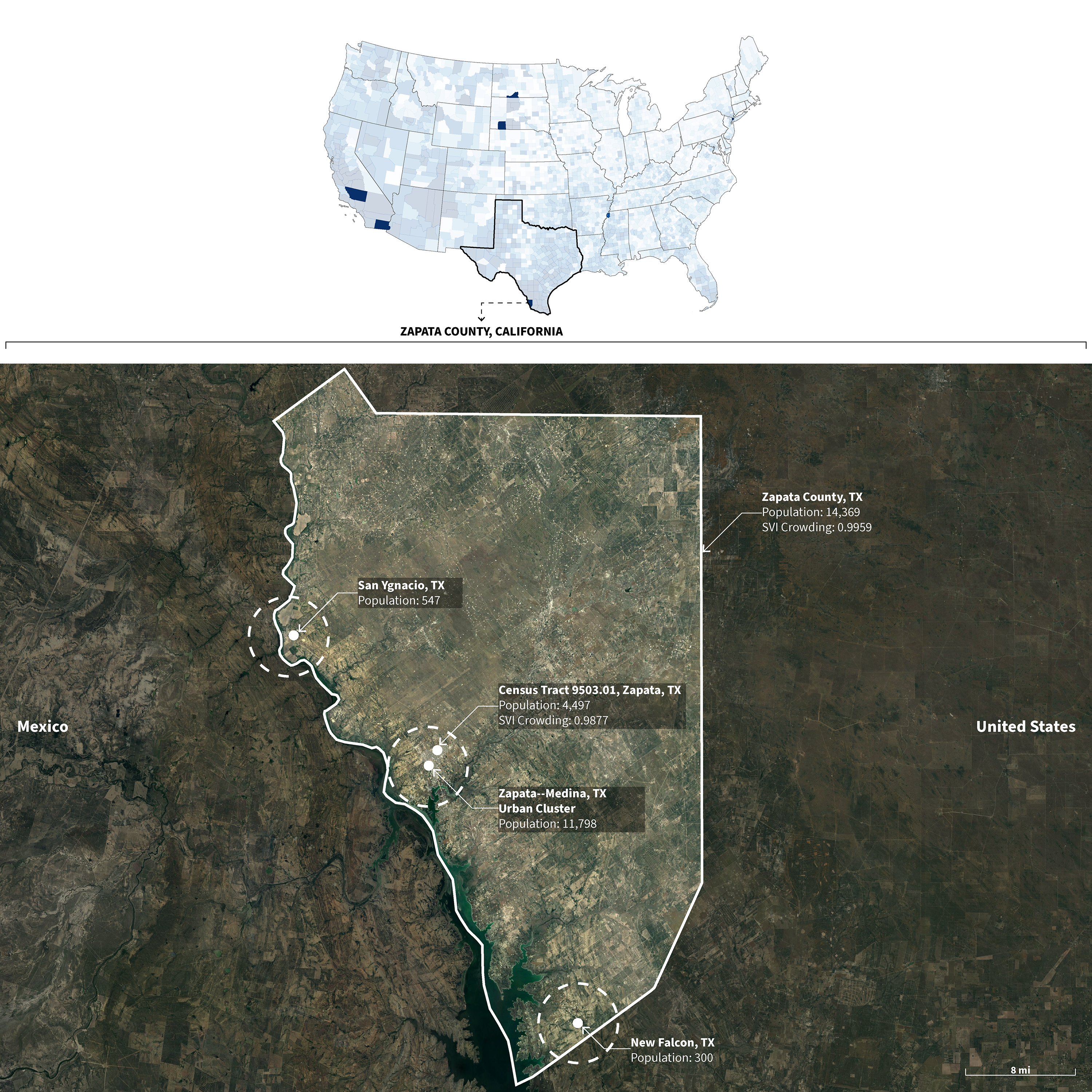
Site 2: Zapata County, TX
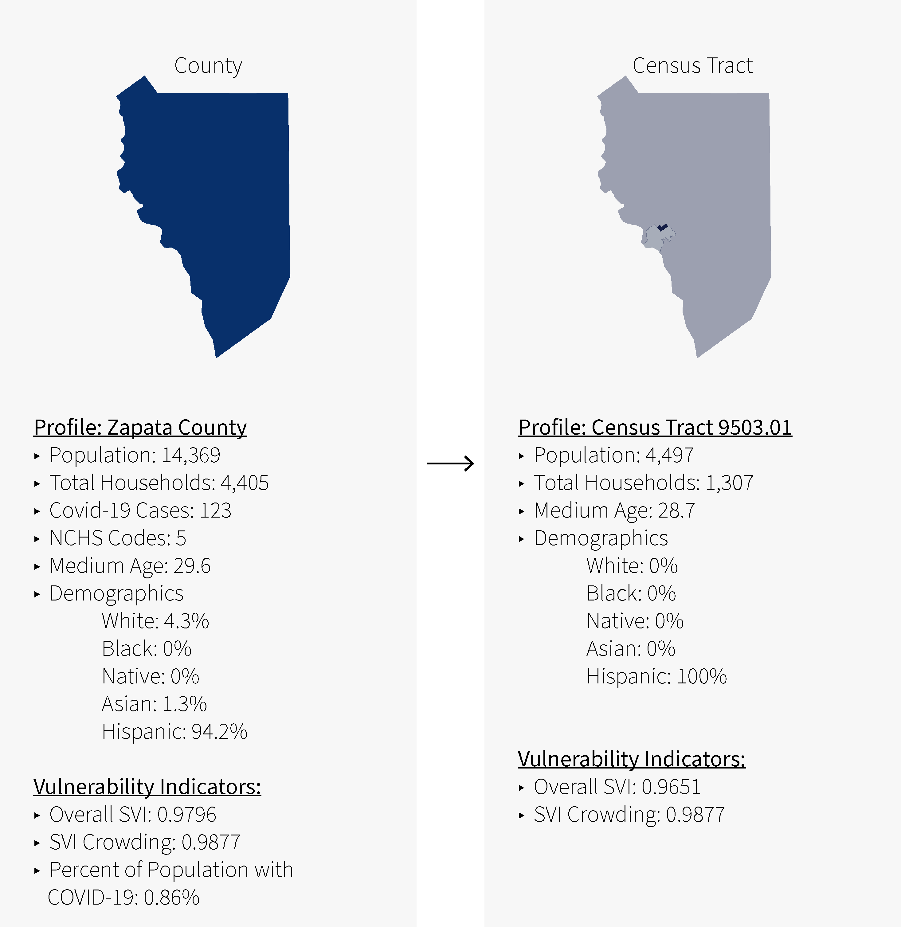
Census Tract
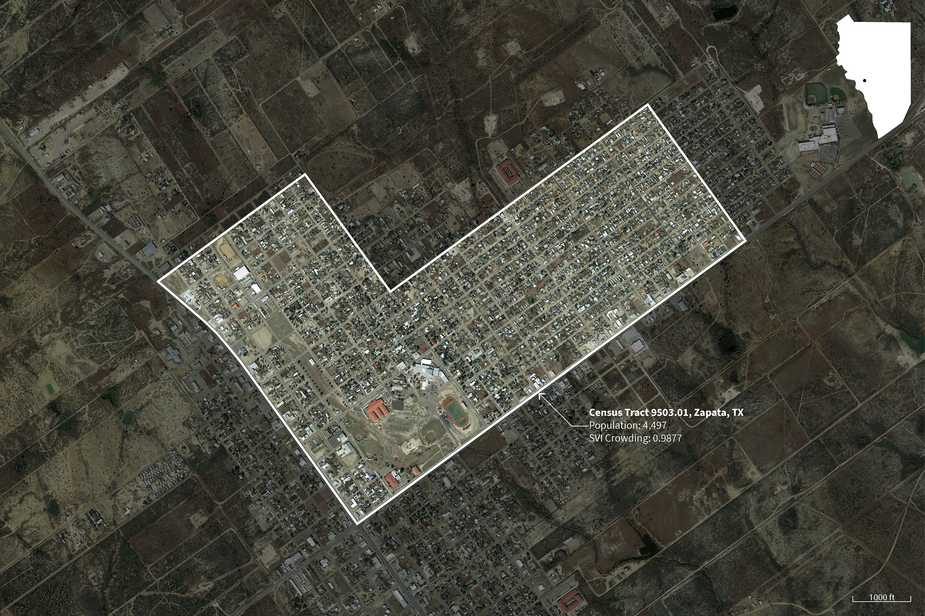
Satellite Images on Site
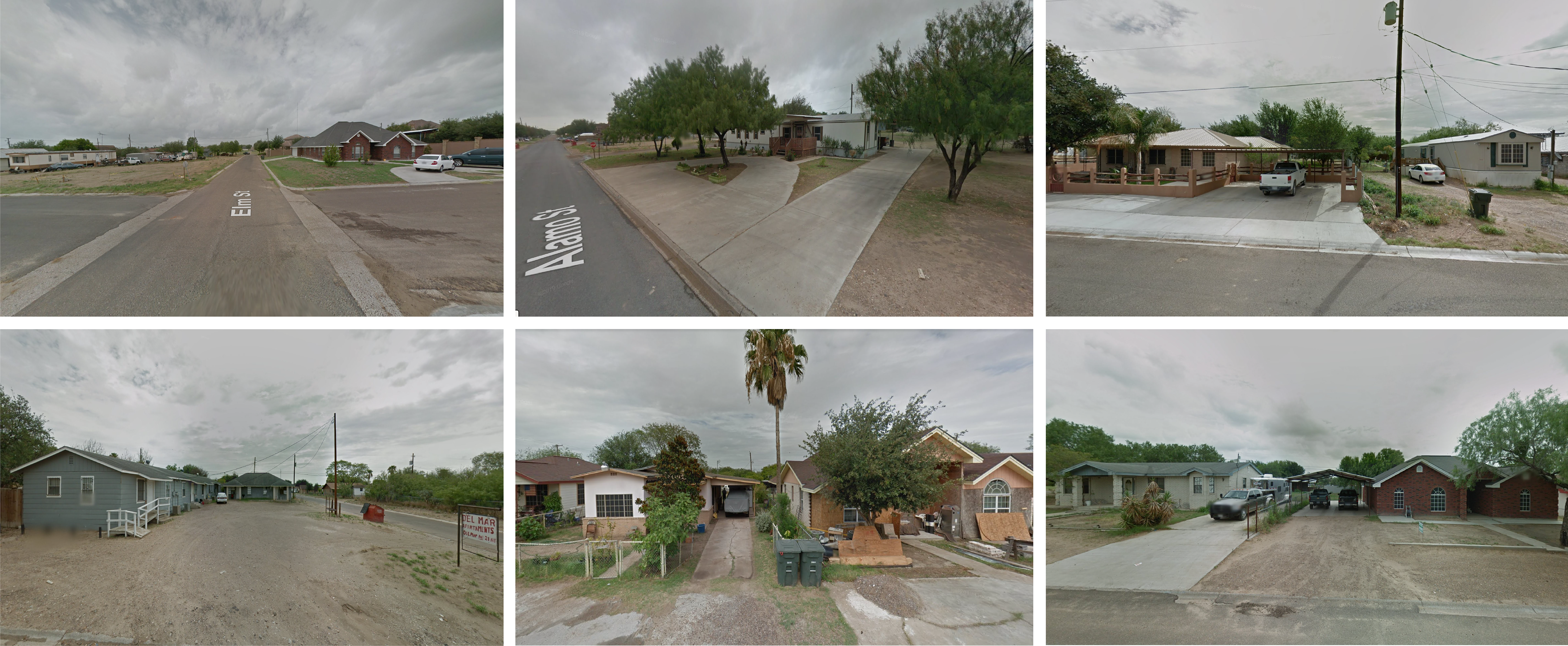
The site above is representative of Micropolitan (5) based on the National Center for Health Statistics(NCHS)/CDC classification.
–
NCHS/CDC Classification: 6
Site 2: Oglala Lakota County, SD
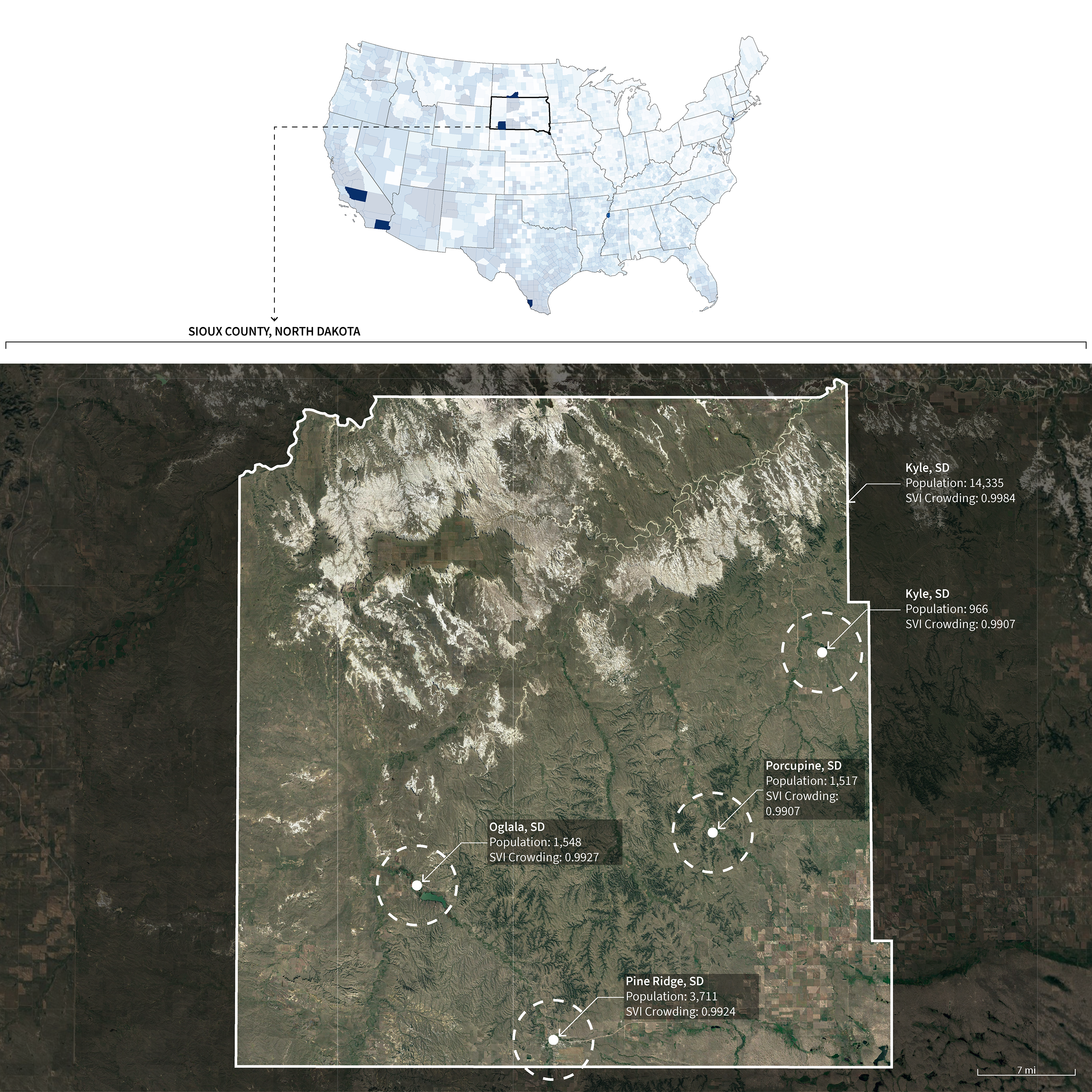
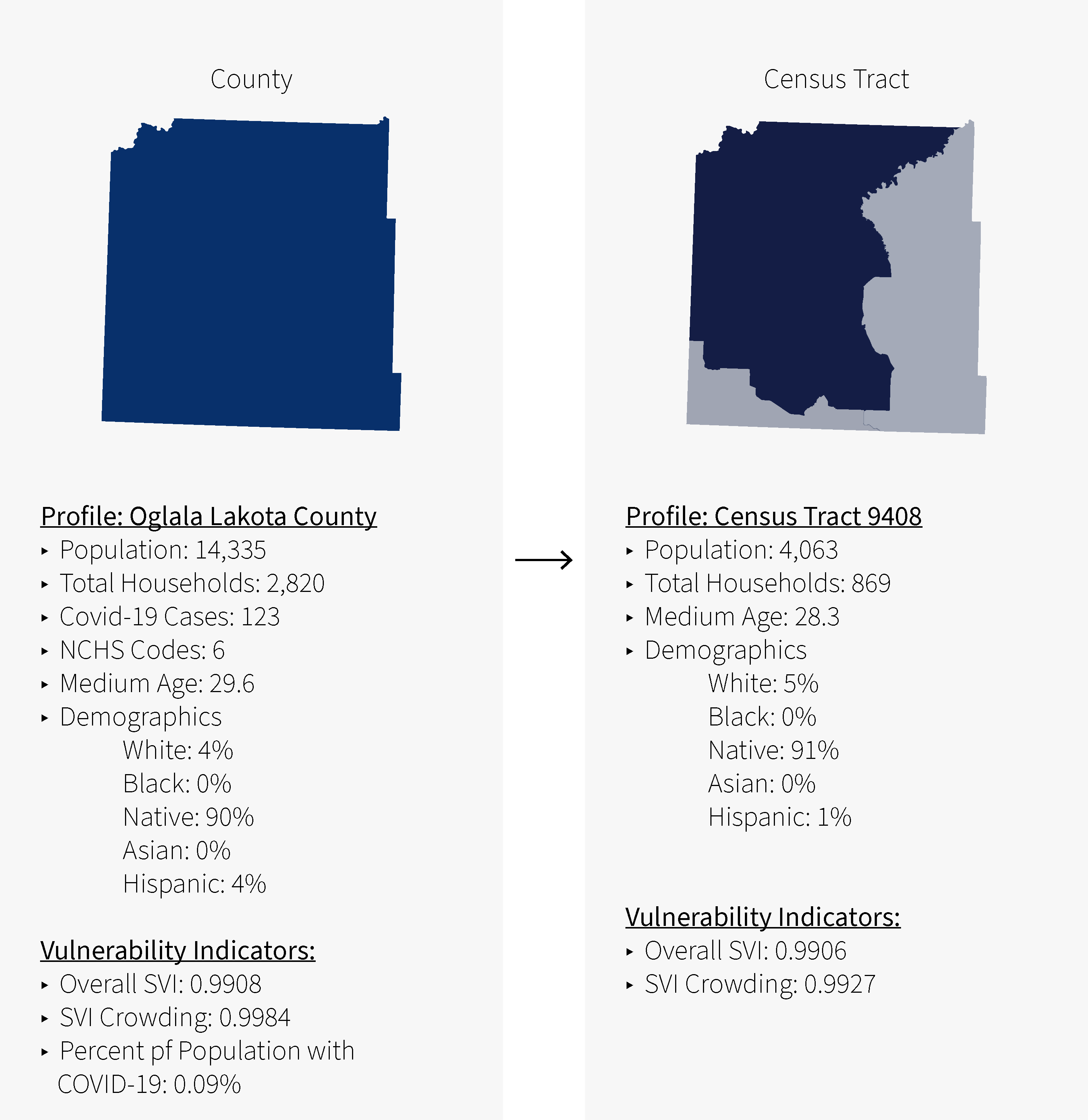
Census Tract
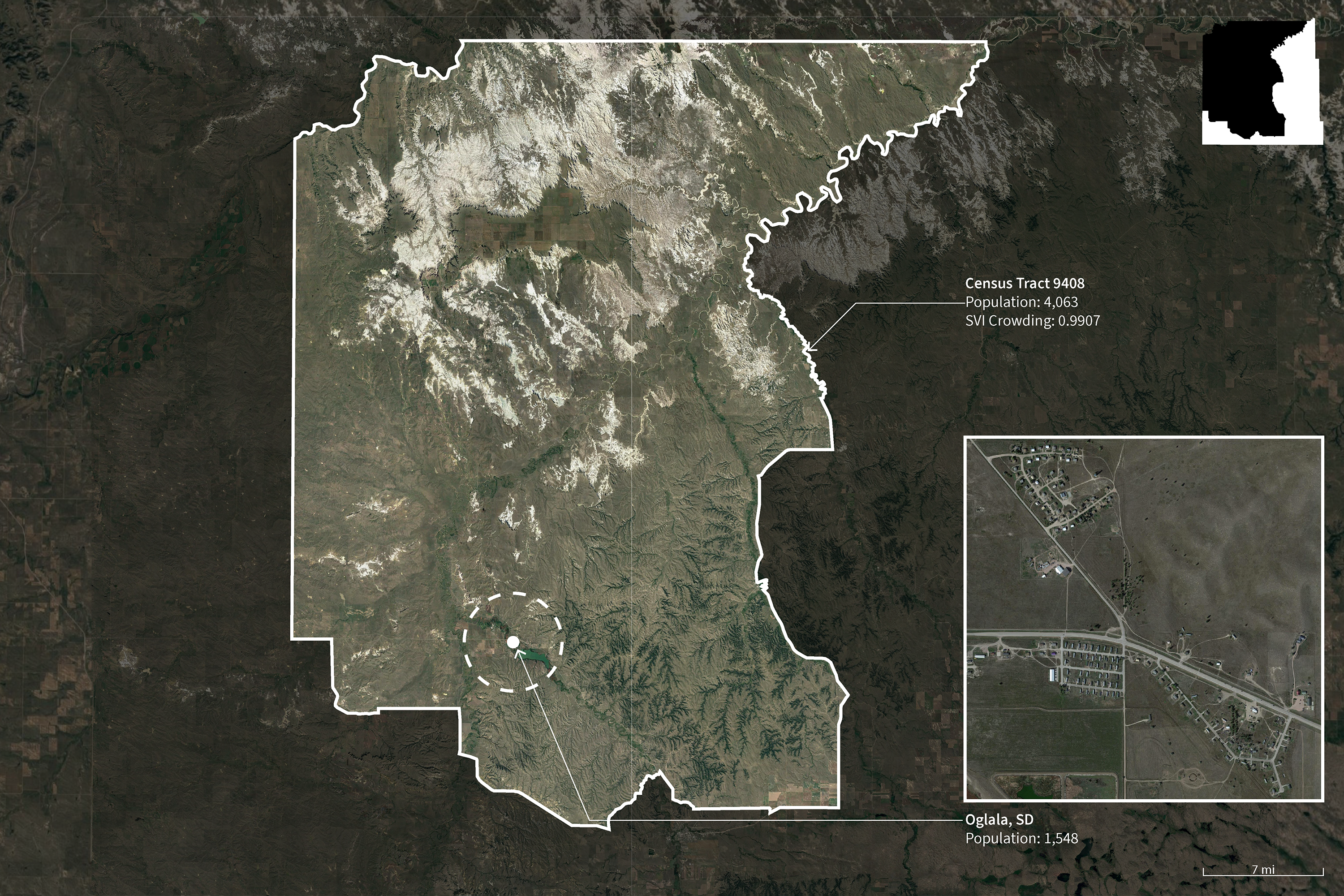
Satellite Images on Site
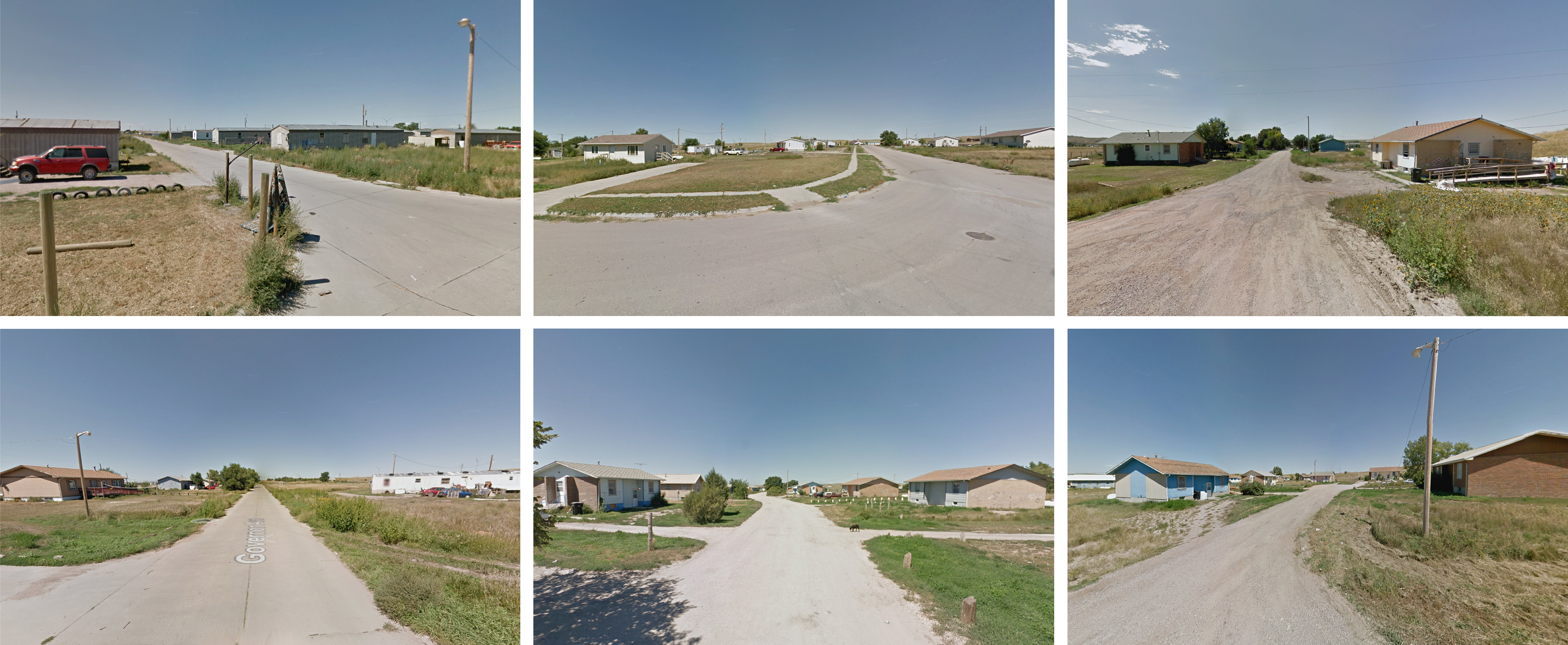
The site above is representative of Noncore (6) based on the National Center for Health Statistics(NCHS)/CDC classification.
–
References:
- “CDC’s Social Vulnerability Index (SVI).” Centers for Disease Control and Prevention. Accessed June 07, 2020. https://svi.cdc.gov/data-and-tools-download.html.
- Census Reporter: Making Census Data Easy to Use. Accessed July 20, 2020. https://censusreporter.org/.
- Cimini, Kate. “California’s Housing Crisis Sickens Families.” CalMatters. February 27, 2020. Accessed July 16, 2020. https://calmatters.org/projects/californias-housing-crisis-causes-illnesses/.
- Community Development Department. Housing Element 2015-2023. PDF file. February 16, 2016. http://www.ruralhome.org/storage/documents/ts2010/ts_full_report.pdf
- Dougherty, Conor. “12 People in a 3-Bedroom House, Then the Virus Entered the Equation.” The New York Times. August 01, 2020. Accessed August 03, 2020. https://www.nytimes.com/2020/08/01/business/economy/housing-overcrowding-coronavirus.html.
- Feldman, Justin. “Does COVID-19’s Toll Reflect Social Inequality? Early Evidence from NYC.” Medium. April 02, 2020. Accessed July 10, 2020. https://medium.com/@jmfeldman/does-covid-19s-toll-reflect-social-inequality-early-evidence-from-nyc-209c3b0a0ff7.
- Goldstein, Joseph. “1.5 Million Antibody Tests Show What Parts of N.Y.C. Were Hit Hardest.” The New York Times. August 19, 2020. Accessed August 20, 2020. https://www.nytimes.com/2020/08/19/nyregion/new-york-city-antibody-test.html.
- Housing Assistance Council. Taking Stock: Rural People, Poverty, and Housing in the 21st Century. PDF file. December 2012. http://docs.bakersfieldcity.us/weblink/0/edoc/1273910/Bakersfield%20Housing%20Element%20(2015-2023).pdf
- Lovett, Ian, Dan Frosch, and Paul Overberg. “Covid-19 Stalks Large Families in Rural America.” The Wall Street Journal. June 07, 2020. Accessed July 25, 2020. https://www.wsj.com/articles/covid-19-households-spread-coronavirus-families-navajo-california-second-wave-11591553896.
- Marvel, Shannon. “Pine Ridge Reservation Holds Strong during COVID-19 Pandemic.” The Mitchell Republic. June 10, 2020. Accessed September 07, 2020. https://www.mitchellrepublic.com/newsmd/coronavirus/6529999-Pine-Ridge-Reservation-holds-strong-during-COVID-19-pandemic.
- “NYC Planning Population FactFinder.” NYC Population FactFinder. Accessed August 02, 2020. https://popfactfinder.planning.nyc.gov/profile/5854/housing?comparator=2.
- Nytimes. “Nytimes/covid-19-data.” GitHub. Accessed July 01, 2020. https://github.com/nytimes/covid-19-data.
- Scott M. Stringer. NYC Housing Brief: Hidden Households. PDF file. October 2015. https://comptroller.nyc.gov/wp-content/uploads/documents/Hidden_Households.pdf
- United States Census Bureau. Accessed July 01, 2020. https://data.census.gov/cedsci/.
- “Zapata County, Texas Coronavirus Cases and Deaths.” USAFacts.org. August 14, 2020. Accessed August 14, 2020. https://usafacts.org/visualizations/coronavirus-covid-19-spread-map/state/texas/county/zapata-county.